


Welcome to the second Doubleshot newsletter. Thanks to everyone who read the last one, and welcome to the new subscribers we’ve gained since then!
To all subscribers: don’t forget to let me know what you think about Doubleshot so far. And if you like it, forward it to a friend :)
🧑💻 Design Compost: Don’t delete your darlings; just put them on another page.
Something I learned in the Type@Cooper program in New York was that, sometimes, a really good design idea still doesn’t work. When designing a set of hundreds of characters, it was easy for me to get stuck on one or two designs that were really interesting—a “Q” with a curly tail, a “g” with an opinionated connecting stroke—and try to keep their weird personality while making them work with the rest of the system. Sometimes—rarely—I was successful, but more often, I was forced (by aesthetics and by my instructor Hannes Famira) to “kill my darlings,” getting rid of a funky little letter that I really loved in isolation, in order to improve the coherence of the overall system I was building.
But most of the time, what I was actually doing was hiding those darlings in alternate characters. You can still see this happening in my publicly-available font, Girassol, where letters like “K” have alternate versions with a more geometric or brushlike feel.
[Listen to Design Notes with Ksenya Samarskaya for more type design talk.]
I do this at my day job, too. As I develop a design concept, and especially as I begin to document its rationale and frame the story around it, I need to cut off all kinds of failed ideas, interesting concepts that don’t work, or sidetrack explorations that I really enjoyed but which weren’t relevant in the end. I squirrel them away in separate pages or entire files unto themselves. I think of them not as waste or mere cuttings from the design but rather as compost.
when I start a new @figma file, I have a “Sandbox” page where there are no rules. when things begin to firm up, it becomes a repository for old revisions.
— Liam Spradlin (@iamliam) July 27, 2023
I think of keeping all these old artifacts like a compost bin – over time my offcuts will turn into fertile soil 🙂
Often, when I’ve moved on to something else, I revisit these files and pull out bits and pieces that are relevant to the new pursuit. All the clippings and discarded bits transform into fertile soil for new ideas.
I do this with writing, too. One editor I worked with had a special note to indicate where “my research is showing,” pointing out sections where it was clear that I included a fact or a story or an entire train of thought just because I found it personally exciting, even though it didn’t really fit with the surrounding material. These, I keep in their own files, too. New essays (and posts on Interface Café!) have been born from these bits and pieces.
The last Doubleshot even featured an illustration I made years ago as a one-off for a palette I was developing!
In any creative pursuit, keeping a sandbox or compost bin is highly beneficial. There’s no pressure to use them—the longer the compost sits, the richer the soil will become when it’s time to plant new ideas.
📚 Skeumorphism and the Morphology of the Interface
There’s a fountain in Zürich, rising a few meters above the pavement outside the central library, just at the corner with the church next door, and across the street from one of my favorite Indian restaurants. Occasionally, you can find the fountain brimming with pink, yellow, white, and orange rose blossoms. On top of the fountain’s central column, there’s a statue of a child carrying a flag and sitting on top of a giant frog, representing the fountain’s commissioner, German book printer Christoph Froschauer, whose name is shared by the fountain itself, and whose frog (“Frosch” in German) motif is shared by several nearby buildings and alleyways. Froschauer’s printing operation, responsible for printing the Zwingli Bible translation and other significant works like Historia Animalium would eventually evolve into the huge Swiss printing house Orell Füssli, which is also responsible for printing Swiss banknotes.
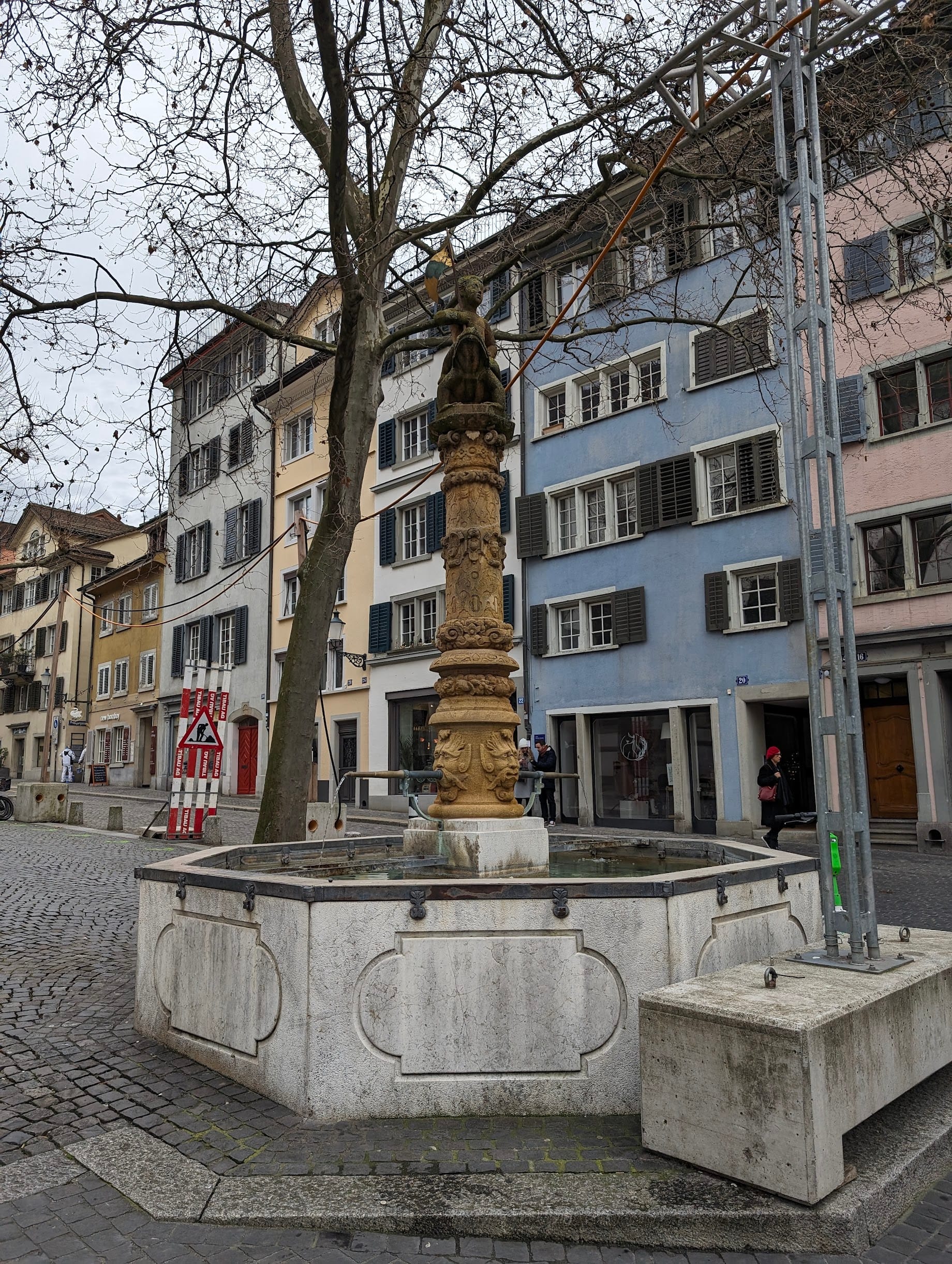
Beyond this history, the fountain is not particularly remarkable to Zürich’s residents; it’s just one of the more than 1,200 fountains that dot the city, which have, at different times, been used and tended by fish merchants, metalworkers, and others among Zürich’s historical guilds.
But the Froschauerbrunnen does serve one other purpose: flanking the fountain’s central column are two long spouts pouring out drinking water day and night. Even if its aesthetic details don’t evoke the history of the fountain for most passersby, the appearance of brass spouts jutting out toward the edges of the pool below them signal that the water is for drinking. Brighter gold-colored spots show where countless others have grasped the spout to take a drink. The spouts emerge from the mouths of gargoyles on either side of the central column; their diameter varies in a smooth curve that accommodates different hands; the end of each spout points slightly downward to create a gentle, shallow arc; and the spouts are both supported by decorative, beveled metal supports, complemented by a shelf-like support for your bottle, bucket, or whatever else you may need to fill.
The exact curves and angles of the spouts and supports may feel arbitrary or, at least, not meaningful to the function of the fountain, but the dialect in which these design elements speak to passersby does not stand on its own. The ornamental elements of the fountain’s drinking spouts are evocative not only of their own history but of the other water sources in one of the world’s most heavily fountained cities. The subjective decisions that led to those curves and angles were made with deliberation, respecting the difficulty of smelting and shaping metal or cutting and joining stone.
How, when, and to what extent meaning is evoked by these elements is all part of the interfacial nature of the built environment. Produced with tangible materials like water, stone, and metal, whose composition may otherwise be unrecognizable, the aesthetics and function of this assemblage must necessarily work together, with even the purely formal elements whose meanings have faded into the background – like the child riding a frog – serving a purpose when the fountain was constructed.
In digital production, we are preoccupied – even singularly focused – on the interfacial nature of our work. As designers within processes of digital production, we are—just like the builders of the Froschauerbrunnen—looking out for the ways aesthetics, function, and subjective meaning work together to create a comprehensive whole. Often, technological constraints have forced the appearance of our work into a visual language more rudimentary than cut stone and wrought metal. Early computers used front panels with huge arrays of lightbulbs to communicate status and information. Seven-segment displays forced numbers – and later alphabetical characters – into coarse and unusual configurations. The first “monitors” in the contemporary sense were often single-color, low-resolution, and used only to display a text-based interface. Even early graphical interfaces were black-and-white, relying on dots and lines to communicate color, shade, or texture. The actual components of early programs like Mousepaint were still largely text-based but included metaphorical renderings of things like pencils, paintbrushes, and erasers, as well as an early appearance of one of interface design’s most enduring metaphors: the floppy disk icon.

Still, decorative elements formed the basis for a comprehensive mental model of the computer interface, one that has persisted largely to this day, with only relatively minor changes (often themselves imposed by technological developments or limitations). The limited capabilities of early monitors didn’t stop designers like Susan Kare from creating some of the most iconic symbols of modern computing, nor did it stop designers from rounding buttons, adding internal strokes to indicate selection, or packaging 12 expressive bitmap fonts with the first versions of MacOS, where previously one typeface had sufficed.
This appetite for ornamentation and aesthetics as part of interfacial meaning-making has kept pace with the development of the technology that affords us the digital interface. One of the most ornamental interface systems in recent memory, iOS versions 1 through 6, relied on embellished visual language not only as a demonstration of its technological advances but also to once again grapple with how those advances would be encountered and understood – or not – by users. The rise of iOS as a consumer operating system brought the concept of the “skeuomorph” into public discussion. Representations of materials like green felt, brown leather, toothy legal paper, and smooth, convex glass permeated iOS 1 – 6, and “skeuomorphism” was the name given to this representation of real-world textures, materials and other physical qualities within a two-dimensional interface. But the concept of the skeuomorph goes back much further, and its original meaning – and importance for contemporary design – has been somewhat lost.

To get a good handle on what a skeuomorph really is, look at Horsey Horseless, a “car” concept introduced at the end of the nineteenth century whose distinguishing feature was a life-size artificial horse head attached to the front. Intended to prevent live horses from getting scared at the sight and sound of an early automobile, the horse head took a physical and functional necessity of the older means of transportation (a horse) and transformed it into an ornamental element. For a more serious example, I look around my office. The double-paned windows to my right each have three horizontal bars inside the air gap, which aren’t attached to the glass itself, mimicking what – in older windows – would be a physical frame around discrete single panes of glass. The bars contribute something not necessarily functional but definitely meaningful and referential to the windows.
We can understand “skeuomorphism,” then, as the totalizing capability of ornamentation. Something that can bridge the gap between the familiar and the novel through reference or metaphor, creating an apprehendable whole. The brown leather and coarse paper of the early versions of iOS didn’t act independently as discrete skeuomorphs but rather combined—like the qualities of our fountain’s drinking spout—to form a total reference that helped users identify the interface by comparing it to something recognizable from another context.
Of course, looking backward toward those older versions of iOS, it’s easy to identify instances of the ornamentation going overboard by current tastes or to see our memory of the interface through the haze of nostalgia, especially given the “flat design” style that would subsume the laborious work of creating realistic visual textures for digital displays. Even heavily graphical “flat” interface design, however, is not without its own historical references. A focus on typography, large, single-color fields, and a reliance on shape, scale, color, and geometric arrangement to convey meaning are all features found deeper in design history, from the Swiss style of graphic design and Concretism to the overarching systematization of modernism, Bauhaus, and constructivist design. And “flat” interfaces are also not without their own morphology. Shadow, gradient, overlap, and shape are all present in “flat” design and help us understand, through allusion to physicality, how things work.
This push and pull between ornamentation and simplicity, between hand-craft and mechanical precision, or between joyous expression and restrained designation has been present in design from the beginning, guaranteeing the continuance of its inherently subjective nature. Whichever style takes root in a given moment owes its prominence to specific conditions of possibility like technological sophistication, historical and social context, and previous developments.
“Skeuomorphism” and “flat” design have nestled themselves in the popular understanding of interface designers as two opposites in a field of visual styles, an understanding that’s complicated by a more nuanced understanding of their histories and mechanics. However, I would argue that this understanding must be complicated if we want to progress toward new styles of presentation that are uniquely enabled by the technology at hand in our particular historical and social contexts.
There’s a clear effort to engage with the morphology of the interface in a meaningful way inside ideas like “neuomorphism,” which has emerged in recent years as a conceptual style that—to my eye—owes its aesthetic reference to suction-molded plastic. As far as I can tell, there is no totalizing meaning in the aesthetic and no metaphorical foundation for meaning-making. It does, however, demonstrate a desire to engage with the idea of how aesthetics and meaning can work together toward a new style of interface design. And I think the concept itself has the potential to engage with contemporary technological potential.
Similarly, “neubrutalism,” which has cropped up in web design, grapples with some of the aesthetic qualities of Brutalist architecture, interpreting them into the interface through strokes, hard shadows, rectangular elements, and strict grid alignments, but also lacks a totalizing meaning—it does not expose the raw material of the interface any more than the next stylistic system and provides no inherent rationale or metaphor.
This doesn’t detract from the visual appeal of these styles, but it does mean that I can’t place them next to more established concepts like “skeuomorphism” because aesthetic quality and meaning can’t stand alone. Visual or tactile quality and the evocation of meaning must be balanced to create a style of interface design that succeeds as a coherent and useful system. This balance is part of what has made Google’s Material Design—the system I work on during the week—so successful over the past ten years. An aesthetic quality (again graphical, leaning on type, color, and geometry) that many would otherwise categorize as “flat design” was made whole and elevated by a considered approach to meaning-making through spatial positioning, lighting, layout, and scale that referenced things we know about the real world.

This balance is something the system continues to explore through capabilities like personalization, opening pathways for meaning-making on the part of users within a coherent aesthetic landscape at a level that would previously be far more difficult to accomplish with technological constraints.
Now is an important moment to unpack the concepts of “skeuomorphism” and “flat” design, among all other aesthetic trends, to extract their actual, definitional contents and leave the empty containers behind. As I wrote in Reshaping Our Expectations for Generative Design, we are better positioned than ever to create an interface that grapples with its own subjective viewpoint and recognizes the potential of technology to create a more coherent, useful, living interface. Understanding how each new visual style we develop for the interface contains, replicates, and transmits meaning can help us make enduring, useful, personal designs that work for more and more people.
That's it for now. If you’re not already signed up and want to get the Doubleshot in your inbox with members-only content, just hit the “subscribe” button to sign up!
See you next time ✌️


