


This post is excerpted from the Doubleshot, Interface Café's bi-weekly newsletter.
Lately, I’ve been spending a lot of time researching and writing about how the interface got to be the way it is—what led to our current ideas around the design process, what elements make up the interface, and why it works (or doesn’t).
As part of that, I keep coming back to the concept of metaphor: how does it show up in the interface, what can or cannot be interpreted as—or addressed through—metaphor? And what happens to our symbolic representations over time?
Metaphor in interface design is a tool that—for many reasons—emerged almost simultaneously with the graphic interface itself. One of the major reasons was that the production of information had already far outstripped the ability of human cognition to deal with it.
This was one of the problems Vannevar Bush grappled with in his description of the Memex, a conceptual future computer that could help us metabolize information into knowledge without getting overwhelmed.
Visual symbolism became one way computers could selectively reveal and conceal information, helping the user build knowledge (understanding) of an unfamiliar and inconquerable information landscape by abstracting it to an apprehensible level.
Despite how long the graphic interface has been around, we’re still grappling with how to best address this today. Justin Clemens and Adam Nash write in Digital Existence, that even a simple online search produces more information (in the hundreds of thousands or millions of results) than an entire team of people could ever hope to untangle. “Perhaps it is the case,” they write, “that these technologies make it impossible to know the very knowledge that they alone make possible to know.”
Shortcuts, in the form of synthesis, abstraction, and, ultimately, metaphor, are just as important to our interaction with computers as they’ve ever been. “We use metaphors,” writes Judith Donath in The Social Machine, “to give shape to the inherently and incomprehensibly abstract world of data ... Metaphors are ... pervasive, occurring in all our thinking about nonphysical concepts.”
The Material Symbols set, part of a design system that is itself based on a metaphor, contains thousands of icons for short-handing complicated concepts like home automation, business management, internal medicine, video editing... you get the idea.
But in the interface, Donath says, reliance on metaphors that are based on concrete concepts “constricts functionality.” This becomes obvious as soon as you boot up a computer. The central conceit of the “desktop,” “folders,” “files,” and even entire apps like the calculator emerged almost simultaneously with the first GUIs that could be manipulated with simple input devices. It shouldn’t go unnoticed that these are all metaphors of the workplace, the corporate context from which early GUIs sprung. Even Bush’s Memex was conceived as basically a complicated type of desk.
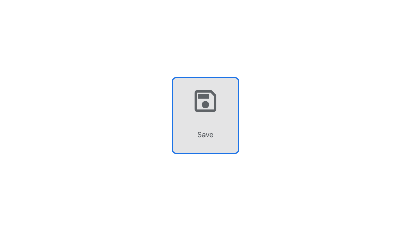
But the metaphors primordial to the computer interface, however limiting, are an interesting case study in the push-and-pull of meaning between human and interface. Take the “save” icon. Its appearance in GUI was a culmination of events before it: the floppy disk, at the time five inches across, had already spurred leaps forward in computing—first obviating the need for punch cards, and then lowering the cost of consumer computers that now needed less onboard storage.
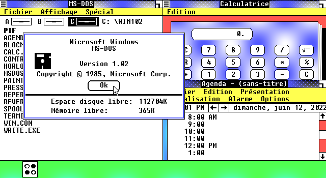
Within the interface of an OS like Windows 1.0, the image of a disk references actual hardware. Replacing strings like “A:\” with a graphical representation of where files were stored (eventually even made accessible through an icon labeled “my computer”) not only demonstrated the physical location of the files but also established a connotation between ideas of information and storage media, heightened by the availability of blank disks to consumers, onto which they could place their personal files.
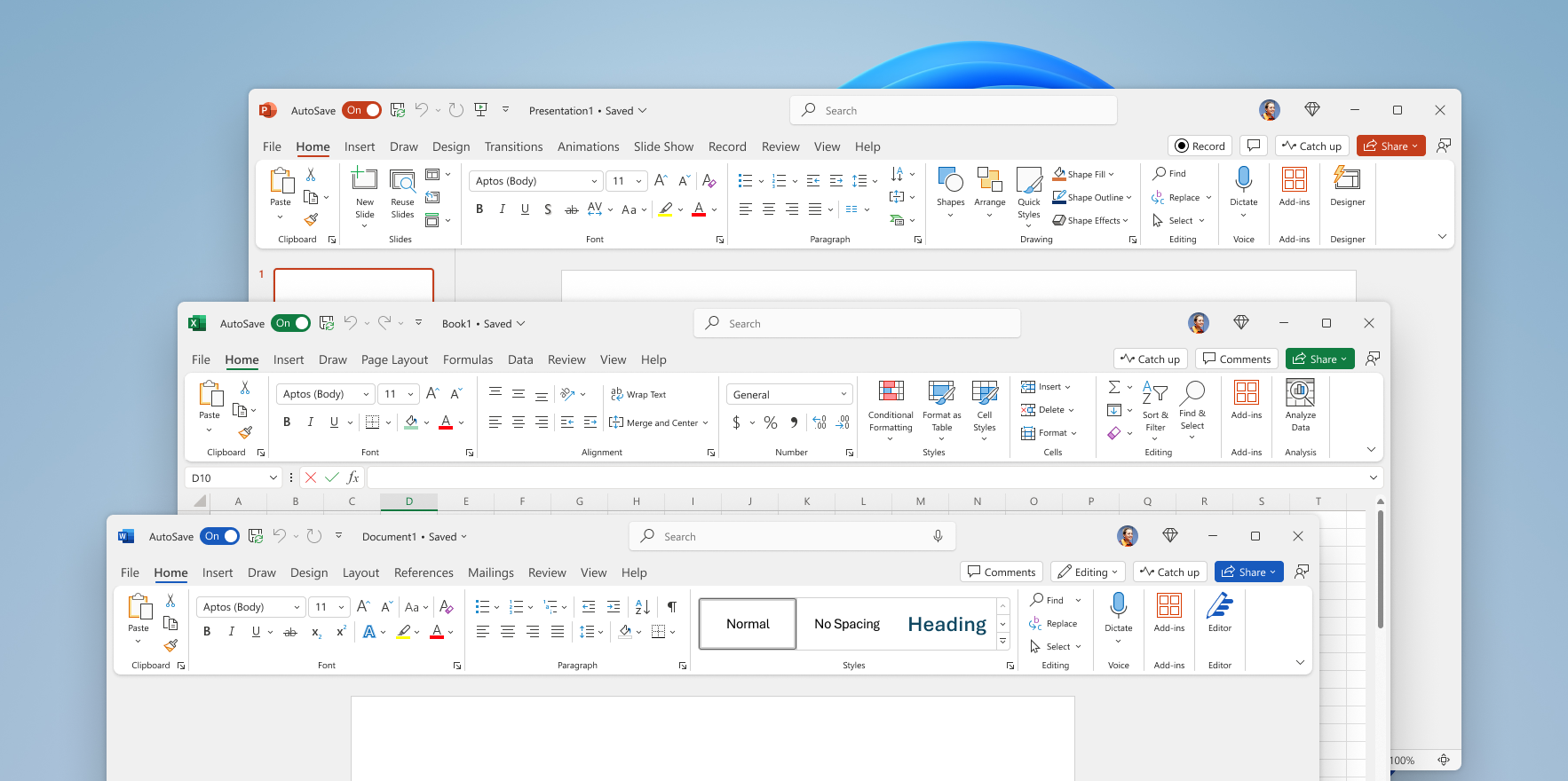
Eventually, computers without floppy disk drives would emerge, but software would still lean on this concrete metaphor as a stand-in for the concept of “saving.” The icon has stuck around until long after the object it refers to faded into the background, only finally being eliminated by software with auto-save features.
The process of creating the icon in the first place was a conscious act of design, and the icon’s transformation into a discrete symbol with its own meaning shows another, much more interesting movement. What happens when a metaphor becomes its own self-contained concept, detaching from concrete reference?
Design synthesizes the world. Clemens and Nash say that design is “a construction of information about the information from which it is made.” This construction is meant to evoke, rather than preserve, meaning, often using the world around us as a raw material. Once a specific material is no longer relevant, are we creating a new category of information for which we’ll need a new synthesis?
I won’t wrap this up with a conclusion, because I haven’t reached one yet. But I think the way metaphor permeates our interfaces points to our continued struggle to live with the complexity introduced by the very constructions we’ve made to manage it.
With the progression of ideas like “spatial computing,” I wonder if metaphorical representation will take another turn. Will we start evoking the meaning of the interface through other sensory cues, three-dimensional representations, or the use of space itself? And, whatever happens, which metaphors from today will survive by transforming themselves into their own discrete concepts?


