There Is No Neutral Design: Megan Kasselberg, Senior UX Writer and Content Designer, Material Design
The storytelling and strategy that goes into a design system as vast as Material Design.
 Liam Spradlin
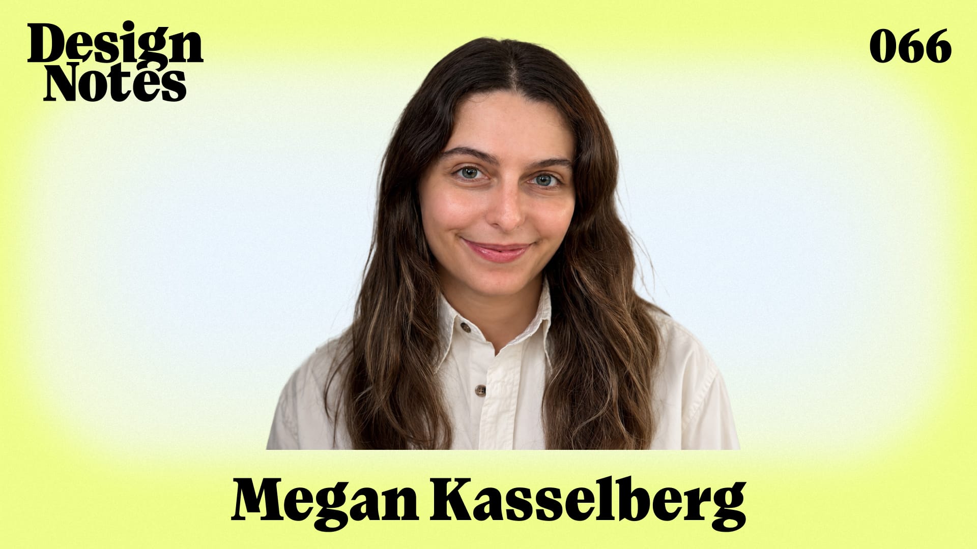
This episode, I talked with my coworker Megan Kasselberg, whose work as a senior UX writer and content designer touches billions of users through the Material Design system.
In our conversation, Megan and I dug into the storytelling and strategy that goes into a design system as vast as Material, including the language of guidelines assets, the effect of earnest expression, and how UX writing is changing in an age of AI.
Introduction
Liam Spradlin: Hi Megan, welcome to Design Notes.
Megan Kasselberg: Hi Liam, I'm so excited to be here.
Liam: So for listeners, um, Megan is a coworker of mine on Material, uh, but Megan, I want you to introduce yourself and what you're working on and what the journey was like that led you there.
Megan: Hi, I'm Megan. I work on Material. I'm based in New York. Um, and I do a lot of writing and storytelling on Material. Um, and it changes a lot, but I started out doing UI writing and UX writing. Um, and over time that's morphed into more of a storytelling role and how, uh, Material creates a narrative for users and internally, um, for our internal customers. How we tell a story in a deck or in a guideline or, um, any other surface, and like how those all weave together.
Liam: How did you get into UX writing?
Megan: Um, I had always liked design, and I was an English major, and I also studied something called behavioral decision sciences, um, which is like decision heuristics and why people make the weird decisions that they do. Um, and I did an internship at Google in UX writing and things just sort of fell into place.
Liam: I'm super interested in what you learned about behavioral science and how that fits into the mix.
Megan: Um, so many things. If you find a $20 bill, you'll spend it differently than if someone gives you a $20 bill or if you like earn it at your job. Um, humans are really strange. Um, and behavioral economics is awesome. I would really recommend checking out, um, Kahneman.
Liam: Okay, I'll add it to the show notes.
The Scope and Structure of Material.io
Liam: So one thing that we work on together is internally we call it Mio, it's material.io. We've been doing a lot of work on that together lately. Listeners might know that material.io is our like everything site for Material. We have guidelines there, we have blog posts, we have uh links out to videos and tools and all kinds of stuff. I did some research before we started recording because I wanted to get a sense of like the real scope of the website because I feel like we're often diving in on specific pages. There are almost 400 pages in the sitemap.
Megan: Wow.
Liam: And that doesn't include the archived versions of many of those pages from like M1 and M2 days. And I feel like in terms of our discussion today, there are so many directions that we could go, uh, in talking about like the creative work that goes into that. But I want to start out by just getting a sense of like how you conceptualize that. Like, how does Mio look in your mind?
Megan: Yeah. That's a great question. Um, recently we just added a third person, but like there's only two full-time writers who work on Mio and we do everything from ideating on what the next article or the nav should be, to directing research on it, to art directing all of the images, to um, like setting the strategy for the site. Um, and then also writing and copy editing everything that you see on the site. Uh, it is a beast. How do I conceptualize it? Um, it's funny, most people don't know this, but we have a version of Mio that's internal only. Um, we have an internal version and an external version. Um, there are some things that are internal only, so there's like brand-specific guidance or guidance on making Google icons. Um, and the whole thing put together is like, it's quite massive.
Um, I don't think that there is a system without guidelines. Guidelines force us to take a concept and systematize it and figure out what the tokens are and what the naming structure is and how we actually think about it and talk about it. And to me, the guidelines are the system, and the system is the guidelines. Like the way that we work is we have a concept for a new component, and it's not until we get in there and we actually write the guidelines and we all collaborate on it there in Figma where we write, um, that we're actually forced to figure out what is this thing and why does it matter and why should people use it and how and where and all of the specifics.
Liam: Can you remember an instance where that process like resulted in something really surprising or like a kind of major revision to a component?
Megan: Yeah, all the time. I think it especially comes up when we start involving our accessibility partners, which we do pretty early on, and Material has its own internal accessibility team. And that's the moment when we realize that these fun ideas that we had, um, don't work at all and we need to change them drastically. So I can think of many issues over the years.
The "Shadow Library" of Imaginary Apps
Liam: Um, and you know, so we already pointed out that Mio the external site has a huge scope. And now we've introduced the fact that there's an internal site as well that has its own specialized guidance. How do you keep all of that kind of internally consistent with itself? Like, how do guidelines become coherent?
Megan: Um, it's so much work. Uh, we draft it all in Figma, and we have a pretty robust Figma process. I think some writers will be shocked by that because writers love docs and word processors, um, and Figma is lacking uh some of those features. Um, but we do side-by-side article templates in Figma where we can see the internal version and the external version, any differences in the imagery, the color schemes, um, the text. All of the links have to point like to an external version, to an internal version. Um, we try to just do it as much as possible side-by-side and just get new designers used to the process.
Liam: Yeah. I can say that the the kind of tooling that the team has come up with to write guidelines in Figma really helps the process a lot. Um, I do think that it's really interesting to write guidance in Figma. I think it might put a different emphasis on the process, um, because I remember the first uh guidelines article that I wrote was for the navigation rail in like 2019, I want to say. And at that time we were still on something internal called spec CMS which was like based on Google Docs. So it was very like writing-forward, but not very like visual consistency-forward. Very arcane process. Um, and my assumption would be, and I want your opinion on this too, that like making that jump from a writing tool that is forced to be a design tool into a design tool that's forced to be a writing tool has implications for the kind of uh feel of the guidelines.
Megan: Yeah, there absolutely are lots of implications. That's a really good point. Um, like there's even times when we're drafting and then I point out to our design partner like, "Hey, all of the words in this are wrong. Like, you're making a new component and we've just copied and pasted the words from buttons in here." Um, but at the same time, I think the imagery is better and it's a tool that we're all comfortable with and um, I mean Figma adding spell check a few years ago was a game changer. So we're figuring it out as we go. Tooling is always a struggle in everything that we do.
Liam: Yeah. On that point, um, do you think that using a specific tool like Figma for this process places constraints on the guidelines in terms of like what we are capable of creating or or kind of visualizing?
Megan: Yeah. And definitely constraints in Figma and also relatedly constraints in our tooling, our CMS, our upload system, the backend for both of the sites. Uh, my partner Austin and I talk about all the time the million ways that we wish that we could improve these sites, but unfortunately we just don't have the bandwidth. Like we talk about tagging things by platform, filtering by platform, filtering by device type, filtering by the interaction that you want to have, but um, again it's just a really small team and we do what we can.
Liam: Yeah, I think people will be surprised to hear that. I mean, I think people will be surprised to hear that any team at Google is small and faces resource constraints. Uh, but yeah I guess that also leads into like, creating the guidelines is like a highly participatory process, um, you know partially out of necessity, but also uh just because the system itself is so big and there's so many people working on it. Um, what does it look like to collaborate with so many designers across the team to like make the guidelines, to force them into kind of systematic thinking about this stuff that they're working on?
Megan: I mean, it's the best. We work with the best crew as you know. You're very good at drafting guidelines Liam. Um, but yeah, it's an interesting thing to take people from like ideating on this one hyper-specific piece of the system and forcing them to think about how this plays with the rest of the system. Especially when you get to like tokens and naming structure. Um, and the tokens that we release externally are a bit different, but the tokens that we do internally are all used by teams across Google. Um, that's where you have to really get into the specifics of like, how does this variant relate to the variants and types of another component? How are we naming them differently, similarly? Um, but generally our team is so good, it's just like a quick reminder of building that into the process. But they're amazing.
Liam: Yeah. I have to agree there.
Megan: You are amazing, Liam.
Liam: Thank you. I will not disagree, but I will not actively agree either.
The Baseline Color Palette Debate
Liam: Um, there's also the kind of meta, um, there's like a meta-textual element to the guidelines where within the guidelines for all of our components and um, you know frameworks and systems, we also have to like demonstrate all those concepts through visuals or motion. Um, and within that, I feel like sometimes there's like a shadow app store of like imaginary Material apps that are in the guidelines. Um, and I want to know like what your perspective is on that because I I get the sense that they're like for the most part kind of internally consistent and they're also like more detailed than what we actually see on the website.
Megan: Yeah. That's a really interesting question. There are so many complications with making these images. Internally we, like, we don't show real apps. And I have to remind people of that a lot. People say like, "Hey I need to draft this quick thing, can I drop in some screenshots?" and it's like absolutely not. We uh, like we have a specific vibe and style. We have an asset creation library that we give everyone. We have fake characters within that.
Um, there's a bunch of reasons for that. Uh, apps change so quickly at Google. What you see on Google Maps yesterday versus today, there's so many tiny miniscule changes. Let alone in a month from now they're more major. Um, so one is just protecting ourselves from those changes and um, wanting something that's more long-term so we don't have to update these 5,000 assets once a month. Um, another part of it is like Google apps are complicated and enterprise, and that doesn't always help our users, especially for the Mio site. Um, so we have to think about what types of apps are people actually making with Material? What types of examples would actually be helpful? If we show dynamic color in this crazy palette, will that just confuse people and make them say, "I can't make a Material app"?
Um, it's yeah, it's a tough balance um, and one that we're always figuring out. But um, when you're scanning a guideline, the first thing that you see are the images, and you may not even read the guideline. You may just look through the do's and don'ts. So we're super aware that in some ways that's the most important part. Yeah. Okay. But I didn't answer your question about this shadow library. Um, I mean, I love it. It's great. We end up copying and pasting a lot of them and theyre really helpful. Um, and I mean I think it just speaks to like how good our design team is that instead of making something new each time they're all like, "Okay, so we have a plant app and here's all of the screens and we'll never make it but it'll show up in our assets."
Liam: Yeah, there's there's kind of a history of Material like designing these really cool apps that are not real and never get implemented. And then the community being like, "What the hell man, I want that music player with the cool transition" or whatever. But I I want to touch on something you brought up in terms of like the complications of managing this huge um library of images, which is the um the Material baseline color scheme. I remember in M1 the story was that they used a teal—I think it was like teal and yellow if I'm not mistaken—baseline that was like meant to be quote unquote "ugly" so that people would change it. Um, and at some point it became purple and we never looked back. Uh, and I I want to know like from your perspective what is the rationale of having that baseline color scheme both like throughout the guidance but also in our design kit? Um, and like yeah, what impact does that have?
Megan: This is a controversial question, Liam. People come at me all the time for our violet asset palette. Um, yeah, so most people won't know this, but um internally we use our baseline blue palette for specs um, and we don't want to release that externally. So this is like one of those secret sauce elements that like we don't want to give people that palette. What are we going to give them instead? Um, and there's a whole range of options. Um, Ruxandra and Andrew Lu designed this palette. I'm a huge fan of it. Shout out to them. They are absolute geniuses um, especially when it comes to color and visual design. Like, shout out to them.
Liam: I will put them in the show notes too.
Megan: I love them so much. They're color wizards and they're some of the most talented people around. Um, and yeah, so there were a bunch of questions about how to create this palette, how to make it neutral enough that it's not ridiculous, but also something that can clearly change depending on the app and the background to demonstrate dynamic color. Um, and this is where we landed. So tell me if you have feedback, uh I do get feedback all the time about this and that people don't realize that it's dynamic and that you can change it and all these apps are purple. You can definitely change it everyone, please please change it.
Liam: Yeah. Yeah, I think that's super interesting. Um, but I I'm also curious like what is some of the feedback, like the critical feedback of the violet palette that you get, or like why would people argue against this? Especially because in my mind it creates um it creates that kind of like scannability that you mentioned earlier where you can like go down the page and look at the skeletons of what's being shown and like understand it pretty quickly. Um, but what's the case against?
Megan: Okay. So I hear from our partners on Dev, developer.android.com, their issue with purple is that a bunch of people are making purple apps.
Liam: That's a fair point.
Megan: My response is that whatever we make the theme, people are going to make apps in that color.
Liam: Yeah. That's true.
Megan: Um, we've had a lot of discussions about maybe we should do black and white to make it really clear um about semantic naming and like shades of gray between. But um, I think the result would be a lot of black and white apps and I don't think that's good for the world.
Liam: Yeah, the ecosystem would get way sadder I think.
Megan: Yeah. On the creative side, people say why is our whole site purple? And like what is the deal with those animations that move around, why is it distracting, why is this like such a fun, silly site? Um, especially when you see the internal version that is much more serious and enterprise focused.
Liam: It's neither fun nor silly.
Megan: Bring back silly! Um, yeah, and that's a fair point too, but I think it's our—the external site is our opportunity to like show what expressive feels like. Like we don't even have to use expressive components, we can use like these fun illustrations um to help ground it in like what should the feeling of coming to these screens be like and what should that joy feel like.
Liam: Yeah. And I think, I mean I don't want to look too deep into it, but I do think that's important from like a philosophical perspective that like, I I believe that like design, both as an act and like the effect that it has, cannot be separated from like its position in the like broader systems in which it's situated. So I think like all attempts to avoid having a perspective or to avoid expression of yourself through the work are doomed to fail. So why not like, why not make an earnest expression of like silliness?
Megan: Yeah, I completely agree. There's no neutral design. So stop pretending like there is.
UX Writing, Personality, and AI Integration
Liam: That leads me to uh, I want to know like on that point, you know as a designer like when I'm making assets for the guidelines, I feel like I have a lot of room for self-expression and like placing my own perspective into the work in a subtle way. Um, I want to know where you locate yourself in the work of like writing for software or writing about software or writing the kind of like narrative of this system that has such a big impact.
Megan: When it comes to the narrative of the system, I find myself often focused on our inconsistencies and our issues, and the the issues that we're passing along to users, and I'm thinking about how to rationalize those and like how they are part of the broader story. Um, right now we're really focused on how to design internally for AI. Um, there's a bunch of awesome things that are going to launch at I/O that you'll see that we've worked on. Um, and with that, it's thinking about who would use this and when and why, and how do we avoid too much of it everywhere all over the ecosystem and how do we do just enough? How do you have a system that's flexible enough for all of these complex products and product teams, each with their own VP or director with different design sensibilities? Um, yeah, it's complicated. It's uh, it's always on my mind. Like what is Material and who are we building for? Because often times we don't know. And part of creating a clear narrative is having a clear audience, and we often have to make that up as we go.
Liam: Yeah. That's challenging. Um, I because I also want to get into like this kind of way that the interface is, like you know implied in the name, is that it's like between two things...
Megan: Yeah. I feel like that gets more at what UX writing is, which you know I used to do and I really haven't done in several years. But I'm quite involved with the UX writing community at Google and how we standardize writing and our writing guidelines in Material and outside of Material, and um, I help co-lead an internal style working group that spans across Google and writers in all parts of the company. Um, so this is something I'm constantly thinking about.
My take that I think is common amongst writers and content designers, but perhaps less common among visual designers, is just that like writing is design and design is writing, and you can't have one without the other. An interface with no words makes no sense. I think in advertising this is more commonly accepted, like you pair off a designer and a copywriter, because like what is the poster for that event with no words on it? Um, but there's times in our industry where people forget that, where they just hand off a screen with um lorem ipsum and they expect a writer to just fit in some words. Um, it's not good for the user and it's not good for Google.
Liam: Yeah, I have to agree. I used to say um, you know when I was learning type design, I I heard someone say like type is interface. What is type doing? It's it's like conveying language, right? And people might say what about icons? And I I want to get your take on that first.
Megan: Well anyone in accessibility would say that icons have to have a label, so like it's the same thing.
Liam: That's the point I was going to make too. Um, it's a mistake to think that, although I believe that icons are typographic, they are so tied to uh subjective interpretation without the anchor of a clear word um that it doesn't count.
Megan: Yeah. I mean I'm I'm constantly thinking about what the voice and tone of Google should be and how it should change with AI. And um, for so long in UX writing it's been a huge boundary and no-no to use first-person pronouns. Like it would be super weird if if Gmail said to you like, "I compiled your drafts into your draft box. What do you think?" Like, or even worse is "we." Like "We're working on it." It's like, who is that? And there's this strange uncanny valley moment. Um, but now with Gemini it's um, people expect that first-person persona and it's becoming really mixed up and complicated.
Liam: Yeah, because there's also like um, or at least you know I'm not a UX writer so for me this is like an open question, but there's always been kind of a mix of practices when it comes to referring to things that belong to the user as well. Like "my photos" versus "your photos," or like "your profile" versus "my profile." Um, and the question for me is like, who is talking? Is anyone talking? Should anyone be talking? Um, and the answer as you pointed out may be different now than it was then.
Megan: Yeah. I mean quick answer is it's always "your," not "my."
Liam: Okay.
Megan: Um, but yeah it's complicated, especially with like voice interactions with Gemini. It's like you're literally having a conversation with your phone.
Liam: Mhm.
Megan: And is your phone Gemini, and is Gemini your phone, and agentic design, and it gets really complicated and messy. But for now um, I think it's a pretty good pattern to separate out chat interfaces from regular interfaces. I don't think all users want AI in everything right now. Um, and we have to provide those boundaries.
Liam: Yeah. I'm also interested in the way that like maybe not personal voice but some kind of expressive voice comes through in UX writing. I think a lot of people probably think about UX writing in like bits and pieces as like um kind of uh labels and titles and headlines and that sort of thing. But like, how is either the writer or like the entity represented by the software like given expression through the text?
Megan: We are about to launch expressive writing guidance. So this is very topical. Um, expressive as a system is so driven by feeling and personality that we've been working for a long time on voice and tone guidance that could go along with that. Um, there's I mean there's a place and a time for every voice and tone in software. If it's a big financial decision, if there's a huge mistake happening, if there's a big error message, if things are confusing, that's not a time to show personality in the system. That's a time to earn trust and be neutral and clear, and even if that clarity requires more text on the screen it's worth it. Like, we have to help users get there. Um, there's nothing worse than like a flippant screen that's like "All set!" when it's like, it's not all set. I'm having a huge issue. I can't pay for my Uber because like this isn't working. Um, meanwhile we have these like welcome screens, loading screens, um celebration screens where it's a moment to show that personality. Um, yeah, it just depends on the context and the moment.
Liam: Yeah. I feel like thinking about this topic and the the writing, and you bring up like voice interactions as well. I feel like there's this recurring conversation about—and maybe this is just because I work in design systems so like I'm hearing this a lot, but um—there's like a recurring idea of asking people or organizations who make software to think about what the voice of that software is, or the voice of their uh brand or their company or whatever they're making the software for. And going back to an earlier point in the conversation, I wonder if like the actual discussion at hand is really about figuring out and expressing the position that you see yourself occupying as an entity who's producing software in the world.
Megan: Yes. But also, I mean I think it depends on whether we're talking about regular interfaces or AI. Again, I'm going to make that separation. Although we can probably only separate those for like six more months. Um, but I I—great UX writing generally blends into the background. It's something that you don't notice unless you work in this industry and then you say to yourself, "Wow, that is a really good neutral statement." Um, generally when you notice UI writing it's um because it's terrible and makes no sense and shouts at you. So again, I think it really depends on the context, the experience, the user, um, the country. Like we have so much research showing the differences in tone expected in UIs in Japan versus the US versus the UK. Um, so it's just about knowing all of that.
In terms of AI personalities though, it gets really interesting. Like people want a personality that's friendly but not too friendly, um, smart but not too smart—like not belittling them. Um, it's fascinating and we can tailor everything about the personality based on these user needs and desires and expectations.
Liam: Yeah, I guess like in terms of blending into the background, it's again that sense of like being just enough that you talked about before, as it is with all of design.
Megan: Yeah. Yeah, yeah, yeah.
Advocating for Writers in Design
Liam: Um, yeah, given everything that we've talked about, from your perspective what do you think that designers who are listening right now should be focused on?
Megan: Get your company to hire a writer, and then involve them early on in the design process.
Liam: Perfect.
Megan: Is that too much?
Liam: That's perfect.
Megan: Um, companies don't invest in writing. It's a weird niche little job and they're investing less and less in it by the day, which seems crazy in our current ecosystem with AI, because everything about AI is text. Um, like you need a writer in there to help determine the personality, to help determine like everything about the response. Um, so yeah, it's a huge area for people to invest in and hopefully with AI they'll start to see more of that value.
Liam: Great. Megan, thank you so much for joining me today.
Megan: Thank you so much Liam, this was really fun.
Liam: You can subscribe to Design Notes on YouTube Music, Apple Podcasts, Spotify, or wherever you're listening right now. If you liked the episode, pass it on to a friend and leave us a rating. Stay tuned for more conversations with creative practitioners across disciplines that will help us learn piece by piece what inspires and unites us in our work. And as always, thank you so much for listening.