


In this episode, I reconnect with my former instructor, type designer and design coach Troy Leinster. Troy shares his journey from graphic design to type design, and explains why learning to make letters makes you a better designer.
We also dig into the importance of trusting the human eye over geometry, the productive friction of sketching by hand, and how understanding calligraphy builds a stronger perspective on type design.
Troy discusses why, in the age of AI, the most important thing a designer can do is put their personal touch on the work.
Liam Spradlin:
Troy, welcome to Design Notes.
Troy Leinster:
Thanks, Liam. Nice to be here.
Liam:
So, we met many years ago when I was a student in the Type@Cooper program at Cooper Union. But for our listeners, I want to know what do you do? What is your current work? And what was the journey like to get there?
Troy:
Yeah. My current work is really, I guess, two parts. One is making fonts, retail typefaces mainly. And the other area is coaching, so helping other people make typefaces as well. I started off as a graphic designer in my previous career and then decided to specialize in the typeface design. I went to Type@Cooper as well and did the condensed program. And then I went to The Hague to Type & Media and did my master's degree there. After I graduated, I was offered a job at Hoefler & Co. here in New York. So, that started my professional journey. And when I arrived, I was asked to TA for Summon the Stone at the extended program at Cooper Union. So, that was the beginning of my teaching experience.
Initially, I wasn't quite sure whether it was something that I really wanted to do, but I knew that it was probably a good thing to do and I wasn't quite sure at the time why. But since 2014, I've been teaching at Cooper Union until recently. About six months ago, I decided to take a break from direct teaching and move more into the coaching that I'm doing. But through the years of working with other people, it's been a great learning tool for me, but also a way to share the experience that I've been gaining along the way as a typeface designer.
Liam:
All right. There's a lot I want to dig into there, but the first thing is this move from graphic design into type design. Because I did the extended program at Cooper Union and a lot of my fellow students were also graphic designers who wanted to learn to specialize in type design. And I'm curious how you arrived at that.
Troy:
Yeah. Type was something that we touched on briefly in my graphic design degree, more how to use typography. But it was very basic and we never really learned how to make type. It was always taking an existing typeface, and messing with it, and not really understanding how letterforms are made and the thinking behind it. So, I always enjoyed working with type. And I just taught myself over the years to use type. And I become more interested in it, but I never have the time to really sit down and try to make a typeface. I mean, I played around in Fontographer and things like that at the time, but I was running my own business and it was very hard to make time to really explore new things.
So, I hit a point in my graphic design career where I was getting very frustrated and unfulfilled. And at that point I allowed myself to go, well, what would I really want to do if I could do anything? And it was really studying type. But in Australia at the time, well, worldwide at the time, it was very difficult to study typeface design. And I think Cooper was really the first program where it just started to open up type design on a wider scale. The other existing programs at the time were very difficult to get into. And the selection process made it hard for people to move across the world and relocate to study.
But I found a little course in Melbourne, as a part of a graphic design degree. It was a three-month unit in type design as a part of the graphic design degree. So, I moved to Melbourne for the three months just to do that, which was just a few hours of contact time a week. But it then allowed me the space to work on those type projects. And that started the journey at that point.
Liam:
Yeah. I mean, obviously you know better than anyone that type design is something that takes a lot of time. So, if you're going to do it, it quickly eats up your entire free time.
Troy:
Exactly. Before you know it, years have passed by for sure.
Liam:
And I'm also interested in, once you learn type design, how that feeds back into the rest of your work. I mean, you went on to become a professional type designer and a teacher, but I'm wondering if it also changed your perspective on graphic design, for example.
Troy:
It did in the sense that I realized how little they teach you in graphic design school or study about type. It's very much about how to use type. And I really believe that learning how to make type makes you a better graphic designer, because it forces you to observe finer details, space, weight, proportion, that you really don't get easily from other forms of graphic design. So, it really refines your eye. So, I think it should be a part of every graphic design degree, really. But I think that made me a better designer by studying type design, although I don't do much graphic design anymore.
Liam:
Something that comes to mind, I mean, I want to get into that, too, because I'm thinking about all the beautiful type specimens on your site and I want to talk about that, too. But something that came to my mind about how understanding type design feeds into graphic design is knowing the context for the typefaces that you would be working on as a graphic designer or working with, rather. And then that brought to mind, this is something that you wrote about and it's also fresh in my mind, because my employer has recently revealed a new logo. Which is how important that context is when you see something like a logo type or when you're making something like a logo type, to know that the uppercase G shouldn't be a circle, for example. And I'm wondering if you can expand on that kind of... the perspective that it gives you.
Troy:
It's an interesting conversation, because as a graphic designer, where we're using a lot of skill in communication and we're very focused on the message and how to portray a brand or that type of thing. But underlying, there's technical aspects and visual perception that I guess impacts what you're creating. And a lot of times we overlook that as graphic designers, and we just make, and we get the illustrator circle tool and make a circle. And then we reduce it and knock the counter out, and there we have an O. And we're really not taught to look further at what that shape actually is. It's really just two circles. It's not an O. And it's not just letter forms, it's logo types or icons, or different shapes.
It doesn't just affect letters, it affects shapes. So, if you're not aware of those details and your eye is not trained to see it, it's very easy to just make what you're making. But we know AI is coming to get us all. And I think this is the time where we really need to put our human touch on things, and really be aware of how we can share what we perceive, and what we can offer, rather than just relying on whatever the program or application we're using puts out.
Liam:
Yes. Yeah. It strikes me that the impulse to fix things, to be "geometrically correct" is very... I don't know. It feels very tied up conceptually with this mechanical mode of production that I think we're all trying to argue against at the moment. And the practice of creating typeface is obviously extremely deep. Speaking for myself in the extended program, I found it meditative almost. I would spend hours and hours on my couch fiddling with the control points. And honest, would still tell me it's wrong. So, it's something that you go extremely deep on.
And that's part of why I am also so impressed by how typefaces are presented, particularly when you launch a new typeface and you have visual assets that are showing off what it can do, what it's meant to do, how it can appear, all the fun variations and options. And I wonder how you maintain a perspective on such a big, complex, deep project like a typeface, so that you can come out with those surrounding artifacts afterwards.
Troy:
Yeah. I think that's what I find the most difficult at the moment is you get right into the weeds with the typeface. And then when it's done, you have to zoom out and show it off. And it's very hard to step back, and look back at what you've created, and have a perspective that can communicate then to the rest of the world what it is that you've made. And it's something that right now I'm trying to spend more time on, and get back into my graphic design skills, and really try a lot harder to communicate that, because I feel like I have lost a lot focused on making the thing. And it's quite exhausting to spend six months a year making a thing, and then you have to go and spend all this extra time to show it off. So, it's a real battle, but it's so important. And it's how you communicate it, I think, mostly, whether how successful it can be.
Liam:
Yeah. I think that's something that stands out to me, too, is the storytelling aspect or communicating your design rationale, particularly in an environment where there are, I don't know, probably millions of typefaces on the planet at this point. I think it could be interesting to get into how you handle that, how you communicate the rationale in a way that shows what at the end of the project you know intuitively to be special and unique about the typeface.
Troy:
Yeah. Well, I generally write a small piece just to describe what I was thinking and maybe what influenced it or where I got the initial idea. And then I try to show the functionality. Because I mean, at the end of the day, a graphic designer is I think looking for a solution for their project. And they've got limited time to search through the millions of typefaces to choose from. And it's very frustrating, remembering back as a graphic designer, trying to find that typeface that just fitted the situation.
So, whatever I can do to communicate how to use it or what the functionality is, I feel like that's an important part for the graphic designer to understand because it helps them get to a solution quicker. But as a graphic designer, you're always trying to find something better or something to represent the idea you have in your head. And often, that's almost impossible. And I think, as a graphic designer, understanding the skill of typeface design can help you solve those problems as well.
Liam:
Yeah. There's a couple of things there about both the functionality of a typeface and also finding a typeface that fits your vision as a designer, or finding a typeface that can fit your vision in terms of its functionality. I'm really curious about the growth of variable type. I feel like when I was a student, it was certainly around before that, but I feel like we were still transitioning into variable type and now it's just here. And I think there are more and more variable typefaces with more and more functions. And because I personally believe that this is a model that applies to UX design as well and that we'll see more of in UX design, I'm curious how you as a practitioner and the industry overall maybe handled that transition or how you think about it.
Troy:
Yeah. I feel although variable type for us has been around for quite a few years now, it's still rather unknown to most graphic designers. And a bit scary, maybe. And perhaps they still are unaware of how it can help them. So, as a process, I make sure that I make a variable version of my typefaces. But generally, people are still buying the static typefaces, because I guess they feel like they're getting more or they don't really know why they should buy the variable font. And I guess, generally, it's a higher price because there's more in it, so you don't get to choose a couple of weights. You get the whole family. So, I think it's still going to take a while for that to permeate and for graphic designers really to get into using variable fonts. But it's certainly something that I think all type designers should be really making. And most are, I think.
Liam:
Does it change how you feel about the typeface or your relationship to the work? Because I think maybe something that could make a designer feel cautious is if you say that the user of your design can open it up and create all these permutations, that in theory we're always in the design space but just unseen. But now it's very easy and you can just turn some knobs. Does that change how you feel about it as a designer?
Troy:
Well, when you load a variable font, you also get the recommendations, I guess, for the weight stops or where the static locations are, but then it gives you the ability to fine tune that weight. So, you might be designing a logo where you have a nice, big word mark or something like that, and then a description underneath. And often, when we're stuck with the weights that the type designer has given us, we can't get the weight exactly right to make it all feel like it's on the same plane, for example.
So, with the variable font, you have the ability to really fine tune that weight so it comes together as one piece, rather than perhaps outlining it to try and make it heavier or whatever the tools can do. So, once you're aware of that, I think it can open up a whole new way of working. And for me, I think that's great. I think giving the designer as much control as possible is important.
Liam:
But it is also possible to make non-recommended or suboptimal variations, right?
Troy:
Right. But that's happening with static fonts as well.
Liam:
True. Good point.
Troy:
Yeah.
Liam:
I want to get into some of your specific projects. So, I'm interested in an example of a typeface that you've released that was made for a specific purpose, and how that came about and how it developed over time.
Troy:
Yeah. I guess, the Brisbane typeface that I first released, that was a project that I started back in 2012 at the type of media program. And originally, it was focused on wayfinding, so I did a lot of research into wayfinding typefaces and started the design process based around that. So, things like character recognition. So, some characters can get confusing when you look at them at a distance. For example, the uppercase I with the lowercase L, things like that. So, making them appear very different or having the ability to switch out forms for ones that make it appear clearer at a distance was an important consideration.
When I finally released the typeface, I wanted to make it also more usable for text. So, at smaller sizes, the spacing has to be a little looser. And Brisbane, which is the typeface I use on my website, works quite well at small sizes because it's spaced quite loosely. And which makes it good for viewing at a distance as well, so any kind of signage at a distance. But up close, it appears quite loose, which means the designer would have to track that in and make it work for that situation. So, that project was probably the main one that had a very technical focus, whereas the other projects that I've worked on for myself are more self-expression. It's like, what am I going to make? And some of them are experimental, I guess.
Liam:
Yeah. I'm thinking about even within a more technical typeface, like Brisbane or a project that is meant for primarily utilitarian goals, typefaces inherently reference history and the location in which they're created. The script that you're designing, references, tools that were used to create that script. Are there other environmental or historical references in your typefaces?
Troy:
Historical references is inherently there, I think, but it wasn't the focus. So, for me to create a typeface that looks similar to something else or I feel like it's done before, it's a huge time investment. I get bored very easily. When I make a typeface, I want to feel like to me it's something that I haven't seen before or that I'm inventing something new, because that's exciting to me. So, I'm not too much into reviving something. That doesn't say that I haven't done that and I won't do it again, but my focus is on trying to invent new letter forms and interesting things to look at.
So, historically, the historical elements are probably how I make it based on where I've studied and things like that. A lot of it comes from the tool, and the contrast models, and things like that. The way I understand them is historical. And then I can play on that, and twist it a bit, and break those norms, but I don't tend to be much of a researcher and I don't tend to look into the previous typefaces as much.
Liam:
Right. I'm also interested in the details. I feel like especially for a typeface that works as a text face, there are so many details that ideally the reader never notices, but that the type designer might be really proud of. And I'm curious what those are for you.
Troy:
For me, when I'm making a typeface to be used as small sizes, the goal is to get a really even color in the block of text. That to me is very exciting. Probably very boring to most people. But I'm trying to get that block of text very, very even. So, breaking that down, making sure that each letter feels the same weight, the spacing really creates a nice rhythm. And those optical things that we were talking about earlier play into that a lot. And so, my goal is to make that block of text look really nice. Recently, I released Multiplex, which was pretty big family for me. It has four widths and nine weights. So, to make the heavier weights in that work well at 10 to 12 point took some serious messing with some of the shapes.
For example, the lowercase letter K and that junction where everything is meeting and it's getting very heavy. I've had to take a lot of weight out. So, when you use that letter up large, you see this weird construction. So, at the moment, I'm making a display version of that to remove those, because what I'm really worried about is people using it up large and going, "What on earth is that?" So, if I can make a display version and remove that so at larger sizes it looks more normal, that's kind of the goal.
Liam:
It reminds me, one of the biggest lessons I think I learned in your classes is that type design really taught me, and I think this has really informed my perspective in UX design as well, that you cannot rely on strict logic in design. You can't use numbers to get your way into something that feels natural.
Troy:
Exactly. Exactly. And often in graphic design you see those presentations, and there's diagonal lines everywhere, and round circles, and things showing the geometric aspect and where it came from. But you can't follow those in typeface design. It just doesn't work. You have to make it look like that, but you can't technically just use the same angle for everything because it doesn't work.
Liam:
It's a kind of sleight of hand on the part of design. I'm also really interested in how the practice of design is conveyed. We talked about your move from graphic designer to type designer, to teacher, to coach. And I recently spoke with David Reinford about his new book, which is based on a series of lectures that he delivered remotely at the start of the pandemic and how his practice of teaching evolved under those new constraints. Obviously, I think the whole field of design exists in a new technological context right now that's giving us maybe some urgency in exploring those types of constraints. So, I'm curious about your approaches to teaching over the years, how it's changed, how you see it now, where you see it going.
Troy:
Right. Yeah. Initially, all my teaching was in person. And when the pandemic hit and we were asked to go online, I thought, I can't teach calligraphy online. How do I teach sketching online? How do I really point out the nuances of designing a particular letter when I'm not with the person? But being forced to do it has been amazing. And it really opened up a new world and spread, was able to reach a worldwide audience. So, basically, anyone that wanted to learn or wants to learn type design can get online now and do that.
I think it actually works a lot better because the students get a whole lot more information. They can see what the other students in the group are doing. They can learn from their mistakes or their problems. Whereas in a classroom situation, it was harder for them to listen in to all the smaller conversations. So, I think from that aspect, it's really been beneficial in spreading the knowledge and skill of typeface design.
Liam:
Beyond teaching remotely, have you seen changes in technology maybe with variable fonts or with the prevalence of different tools for designing fonts? Have you seen that impact how you convey the principles of type design over time?
Troy:
The process certainly changes. And the new tools that are coming out or that people are developing is definitely helping the process go faster. But it also democratize the whole industry, so anyone can make letters and whatever. I think that's really great. But obviously, you see a lot of stuff, professional stuff that's probably not up to scratch. So, in that sense, well, in a good way it removes barriers to entry, but we now then need to help and support those people that are really into making type to improve what they're doing and learn more. And that's what my coaching is all about. It's really just working with other designers to help them have that professional standard, I guess.
So, the tools, I think there are new tools coming out. And with AI, I'm sure there's going to be a lot more that are going to make the process of type design a lot quicker. But we still have to be sure to check, and proof, and review what the output of those packages provide, because a lot of people are just pressing a button and it's coming out. But when you dig down, you can still see all the issues that need the human eye to refine. So, big changes. Exciting, but new challenges I guess.
Liam:
Yeah. It's that subjective impact that we talked about, the thing that you maybe can't see until you look close.
Troy:
Right. Or it's pointed out by someone else. Yeah.
Liam:
I'm also interested in the material qualities of teaching type design. Particularly, you teach calligraphy as part of the principles of type design. Also, probably to demonstrate the historical tool usage that resulted in the scripts that a lot of us are reading. I'm just interested in the inherent tactile nature of learning that way. I don't think in my own practice, I haven't put out anything publicly since Girassol, but I haven't found a way yet to create letters without first drawing them. And I wonder what that means for the work.
Troy:
Yeah. I feel like experiencing calligraphy... when I demonstrate calligraphy, it's not coming from a professional calligrapher's background. It's coming from a type design perspective. So, it's more about showing the contrast, the possible contrast models that you have, and how the tool influences those models. And when you use it and you can feel it, when you're then designing a typeface, you understand how those strokes are made or where the ball terminals come from, or what are the options for the solution. And when you can feel it in your hand, because you've kind of done it, that I think is really beneficial.
The calligraphy also allows us to understand the relationship between different strokes and how they inform different letter forms within the alphabet. So, most of the lowercase letters are made up with five basic strokes. They are slightly modified, slightly different angles, but it's amazing to believe that only with five strokes you can get all of those letter forms. And when you understand those relationships, when you get to a particular letter and you're not sure how to solve the problem, you can look to other forms that you've already designed and the answer really mostly is there. Or you can find new relationships and switch it up. So, it allows you to then break out of the standard model and explore new relationships.
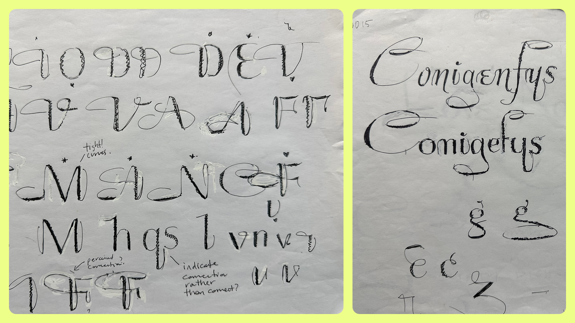
By understanding those stroke relationships, you avoid repetitiveness or modulation, that type of thing. You can find a nice balance with form, so it's interesting rather than repetitive. So, that's very useful. And also, sketching on paper with a pen is very important to me. It allows you to have more of a relationship with your ideas. And it captures all the bad ideas, which can then be good ideas. There was a time where I was exploring using the iPad to sketch, but I found I was immediately erasing or altering, or improving, and I was losing all of my process. And the process is super important, because when you look back at your sketches in six months time and you've had a period of time to detach from them, you see them in a different way and you see new things. If you've erased all that, there's nothing there.
You've really just got the end result, which is not very useful. So, the sketching process was something that was difficult for me to get into. But once I got into the swing of it, it's something I use all the time now. And sketching on or digitizing letters, it's very hard to come up with ideas when you're just moving things around. It's almost like the pool of ideas is endless or the solution is endless. Whereas, if you take a break, go back to sketching to solve the problem, it will be a lot quicker.
Liam:
Yeah. I'm so interested in that connection. I mean, first of all, the friction that's generated by sketching with a pen is productive directionally. But also, I wonder if there is a link. I'm thinking back in the conversation to notes about the details that make something really legible or make something good for text sizes, where you would be reading long passages. And I wonder if there's a connection between those qualities and the hand-drawn nature that type ultimately has, the references to the tools that you're using, things like that. I'm not exactly sure what the question is there, but there's a connection forming in my mind and I wonder what you think about it.
Troy:
Yeah. I think it just feels more human. Even if the letter forms are designed to feel more industrial or more mechanical, I think using your hands to develop ideas is quicker. It's more human. The process feels like you're a lot more connected to the result. Whereas, I think if it's all just digital, there's an element of disconnect and there's also limits, because you're using a tool that is quite limiting. Those Bézier curves, they only do certain things. And it's very easy to draw a circle and then attach that to the leg of the whatever. Whereas, if you sketch that, you have a vision and then you can replicate that vision digitally, which is a very different process.
Liam:
I remember speaking of drawing a circle, something that really opened my eyes as well in the Type with Cooper program was learning that there's like no such thing as a circle on a computer. I'm thinking about the old... What were they called? Splines. Basically, like a tangible Bézier curve in real life with the little things that mark the, what I guess would be control points. Even that when you plot it on the computer is actually not the curve. There are inherent constraints placed on the work as soon as you translate it to a digital environment. We rely on metaphor to understand what we're looking at. And I guess when you're baking in so much humanity at the start of the process, maybe that means that there's just enough left on the other end to really make an impression on the reader.
Troy:
Yeah. Well, it's interesting, because when you scan in your hand sketch and you trace it, you never get what your hand sketch is. So, often, I will teach students to, yes, let's trace your letter N to start with. And then remove the template, and look at your sketch, and really try to then get what your sketch is communicating, and try and get that into your drawing. Tracing never captures that. Even tracing when you're sketching, it's like, is the line on the outside of the curve or the inside? You never quite capture it. Whereas, if you sketch it and build it up, that will allow you more control because you have the time to look, adjust, reassess.
When you're drawing a line, it's done. And if it's not what you want, well, you got to start again. So, the sketching process is really useful for that. And I think when you're trying to replicate that digitally, you really have to observe, rather than literally trace, because it just doesn't look... It's very hard to get that feeling back into it.
Liam:
Yeah. There's like a perceptive quality when you're sketching and a separate perceptive quality when you're tracing. And you're perceiving two different things, so probably you're interpreting them differently.
Troy:
Yeah. Yeah, sure.
Liam:
Previously, I used to ask people about the future of their industry, but I think we have enough future right now. I'm curious what you would say to designers. What do you think is something important that designers might not be considering right now, but you think that deserves some more focus?
Troy:
I really think that the time in which we're in where I have no idea what's going to come next, and I'm sure most people don't. I think we really have to focus on putting our personal touch on what we create. And that just means drawing the circle that you think is a circle. When I draw a circle, you may not like that circle. When I redraw the Guggenheim logo, some people hate the solution that I come up with, but that was my solution at the time. Do you know what I mean? And now, when I look at it, I would probably do it differently. But that's the great thing about human perception is it's constantly evolving.
Once you've made something, you want to make it again and make it better, but we have time constraints. But I think if you can lean into that more, I'm hoping that will save us. I have no idea whether AI is going to be able to eventually replicate that, but I'm hoping that human perception is the thing that's going to get us by. So, I think we need to put our opinion into it, our touch on it, and our view of the world in our work.
Liam:
Yeah. Claiming your spot in design as a subject.
Troy:
Right. Yeah. Whether it's right or wrong, you have to take the risk, otherwise it's all just going to be the same.
Liam:
For sure. That's a great point to close on. Troy, thank you so much for joining me. This conversation absolutely flew by.
Troy:
Thanks so much for having me. That was a great discussion.


