


About a week ago, Goodreads introduced its new logo.
Our new logo is designed to better represent Goodreads and is optimized for accessibility so it looks clear and sharp no matter where you see it—from your phone to a billboard. The lowercase "g" incorporates a magnifying glass over an open book, symbolizing the book discovery and sharing of perspectives that are at the heart of the Goodreads experience. It’s fun, friendly, and focused on books—just like Goodreads. —Goodreads Blog
The logo looks like it could be a customized version of Souvenir, a cushy serif typeface from the early 20th century, designed by Morris Fuller Benton.
The key feature is the lowercase “g” which also serves as a standalone logo/app icon. Goodreads says the g is designed to look like a magnifying glass over an open book. The first thing I noticed looking at the lowercase g is its unconventional “leaning” quality. Like many iconographic depictions of magnifying glasses, the bowl looks diagonally-oriented, a quality type designers usually try to escape.
This comes, I think, from two aspects: one is the ear on top of the g. It points straight out from the bowl, rather than to the right or in a simple curve like many lowercase gs.
But this works in conjunction with the orientation of the bowl itself. Here, the contrast model of the logo face is broken. While all other models have an upright (or “expansion”) contrast model, the g uses a tilted (or broad-nib) contrast model.
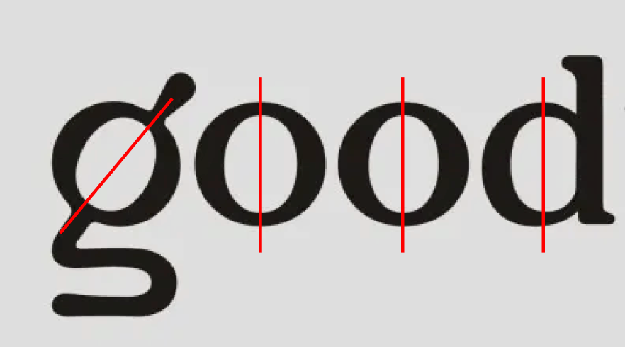
This distinction typically signals that a typeface is inspired by a different stylus, but here the two are mixed. That makes the “magnifying glass” of the g look particularly tilted over its “book” tail, since the visual pattern established by thick and thin strokes of the rest of the letters is disrupted.
It’s a small detail, but one that I think adds a lot to the updated logo, though I would love to see the tail of the g pushed a little further to integrate it with the rest of the letters.


