


As soon as you make it possible to move between two screens in an app, you have navigation. Although creating navigation is simple, creating the right navigation for your users is more complicated.
That's how the original primer on Android navigation, which I wrote back in 2017, started off. And it's still true today! What's changed, though, is the number and variety of navigation components available to Android developers and their specific behaviors.
Since 2017, we've gone through two more iterations of the system, and its adaptive capabilities have expanded to consider users' experiences across different devices and contexts. Now seems like a good moment to revisit the navigation components, how they're used, and how they can be combined to create great experiences for your users.
I'll structure this post the same way as the original, so you can flip back and forth to see what updates have been made.
✏️ Defining Navigation
Before we get into specific components and patterns, it's worth stepping back and building a definition for navigational structures. First, two things to keep in mind while defining your navigation:
- Build navigation based on tasks and content.
- Build navigation for people.
Building navigation based on the tasks and content in your app means breaking down the things people will want to do in your app, what they'll see along the way, and mapping out the relationships between the two. Determine how tasks in your app relate to one another—which ones are more or less important, which tasks are siblings, which ones nest inside one another, and which tasks will be performed more or less often.
Building navigation for people means taking users' intentions and desires into account. The people using your interface can tell you a lot about whether it's working for them, and your navigation should be built on helping them succeed.
Navigation Hierarchy
To help you map out the task/content relationships in your app, you can consider a few different configurations:
Parent/child
The parent/child relationship is one in which a higher level of the hierarchy is associated directly with one or multiple lower levels that are all accessible from it. The higher level is a "parent" and the lower levels are its "children."
Siblings
The lower levels in a parent/child relationship, if they are all considered equal in the hierarchy, are "siblings." Siblings do not have to be directly accessible from one another, but can be assembled together using components like tabs or bottom navigation.
Collections
A collection is a set of destinations that are typically—but not always—siblings, presented together in one place. Take, for example, a list of links or a set of cards that lead to similar—but otherwise unrelated—destinations.
Links
A link allows a user to move quickly between destinations that aren't navigational adjacent. For example, from a child into a different parent or vice versa.
✧
One technique you can use to sort out these relationships is... Sorting cards. Break down your app into its tasks—don't worry about specific screens yet—and lay them out according to how they're related. Put the primary task (for example, "browsing products") at the top, and branching tasks (like "search," "view a category," or "view card") underneath. From there, you can map out further subsequent tasks, drawing lines between them according to their relationships.
🧩 Navigation Components
Now that you've got an idea of your tasks, let's get into the meat of this post—all the Material navigation components and how they work.
Navigation Bar

Definition
First, the component that's become ubiquitous in apps over the last decade: the navigation bar. Sometimes called the "bottom bar," "bottom tabs," or "bottom navigation," it's a bar that sits—usually persistent—at the bottom of the screen. On Android, it's made up of between three and five primary destinations in the app. Things like a "more" page, settings, menus or dialogs are not primary destinations and should not be included here.
Despite their colloquial names, items in the bottom bar do not behave the same as items in a group of tabs (discussed later). They are primary destinations at the very top of your app's navigation hierarchy, not siblings under a shared parent.
The navigation bar is a convenient way of jumping between primary destinations, or from child to parent destinations quickly no matter where you are in the app. They also have a very helpful synergy with the navigation rail (discussed later) that can keep the navigation model consistent across devices.
On the other hand, space is limited in the navigation bar. If your app truly needs more than five primary destinations (a rare case, but possible!) you may need to use a navigation drawer to supplement this component, or do some other reorganizing.
Navigation Bar in Use
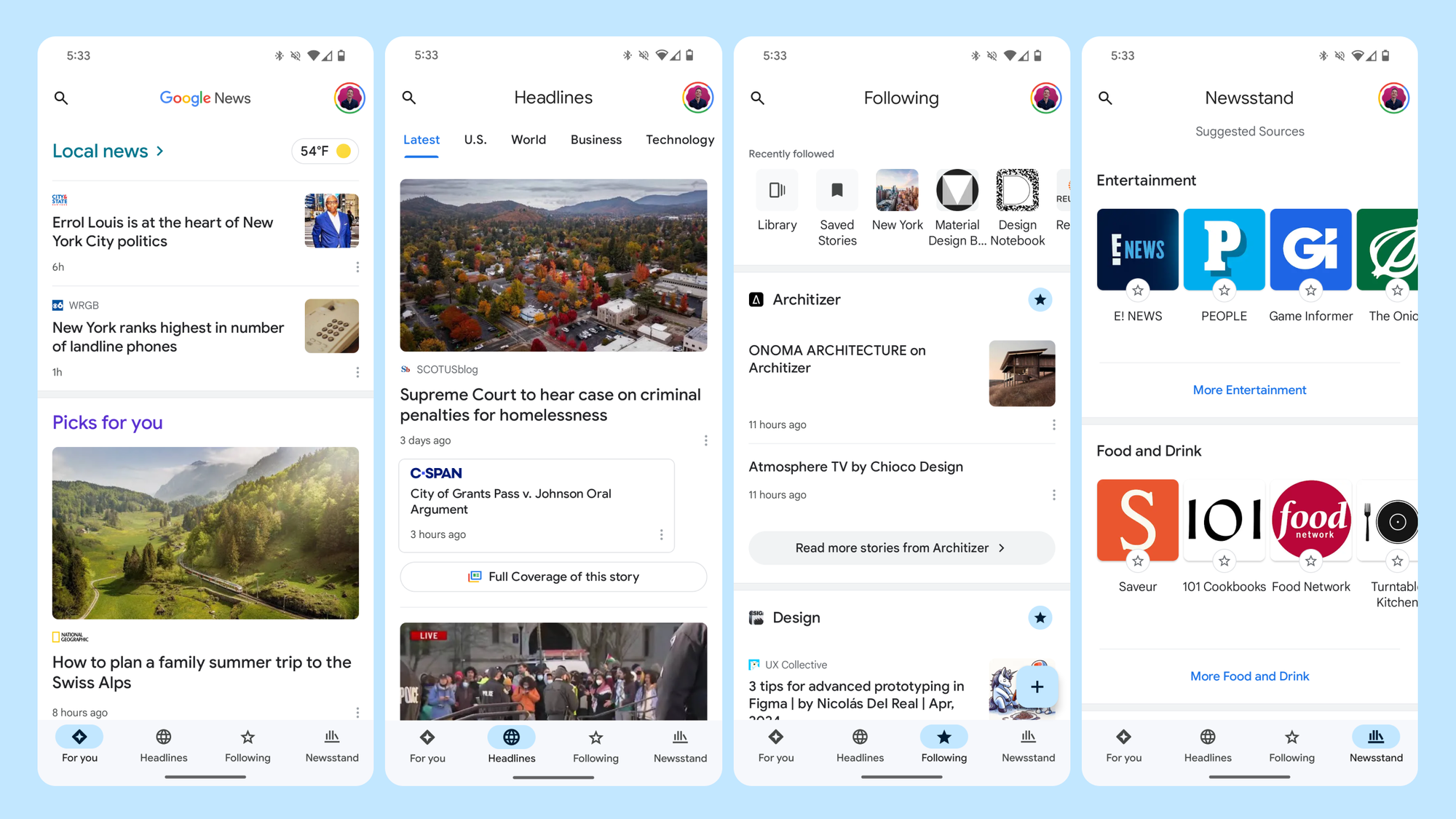
Google News uses the navigation bar in a very straightforward way, and manages to keep all of its top-level destinations there.
The navigation bar only disappears when reading a specific story, an example of a link relationship described earlier.
But not all uses of the navigation bar are so straightforward. Take, for example, Google Photos:
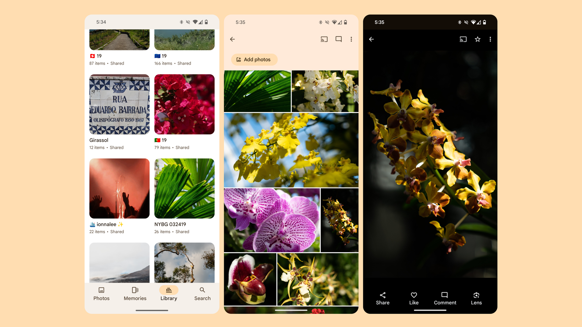
In Google Photos, the navigation bar provides access to a very shallow navigation hierarchy, only one or two levels deep. Most of the destinations in the navigation bar take users to more immersive, single-purpose settings, like scrolling through an album or viewing a single image. In cases like these, it may be preferable to hide the navigation bar. This prevents users from jumping to a different top-level destination as quickly but allows you to create an immersive screen that eliminates all unnecessary controls.
State Preservation
Navigation bars can either preserve the state of their destinations—like tab selection, scroll position, etc.—or not. If your app requires users to switch between destinations or view different screens comparatively, preserving state is the right way to go. In general, though, navigation to deeper destinations (children, links, etc.) should not be preserved unless specifically needed for your app.
History
Since navigation bars involve quick, frequent switching, they should generally not create history in the system's back-stack. Going deeper into the hierarchy of individual destinations can create history.
Tapping an item in the navigation bar should take you straight to the associated destination, and tapping it again should reset temporary states like scroll position.
📚 Find more guidance: navigation bars on Material.io
Navigation Rail
Definition
The navigation rail is similar in behavior, appearance, and function to the navigation bar. The component was specifically designed (by me!) to pair with bottom navigation, creating a cohesive navigation model across screens.
Just like the navigation bar is positioned at the bottom of the screen, the navigation rail is anchored to the "start" end of the layout (the side of the screen from which content starts—in left-to-right languages, this is the left side).
And, similar to how the navigation bar should only be used on compact screens, the navigation rail should only be used on medium and expanded screens.
Find detailed guidance on window size classes on Material.io
Navigation Rail in Use
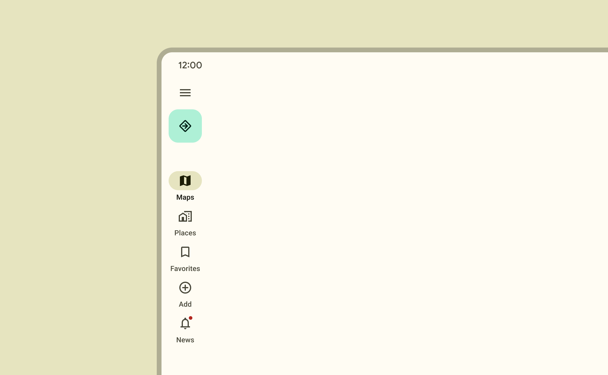
The Android Clock app adapts its navigation destinations directly from the navigation bar to the navigation rail on larger screens.
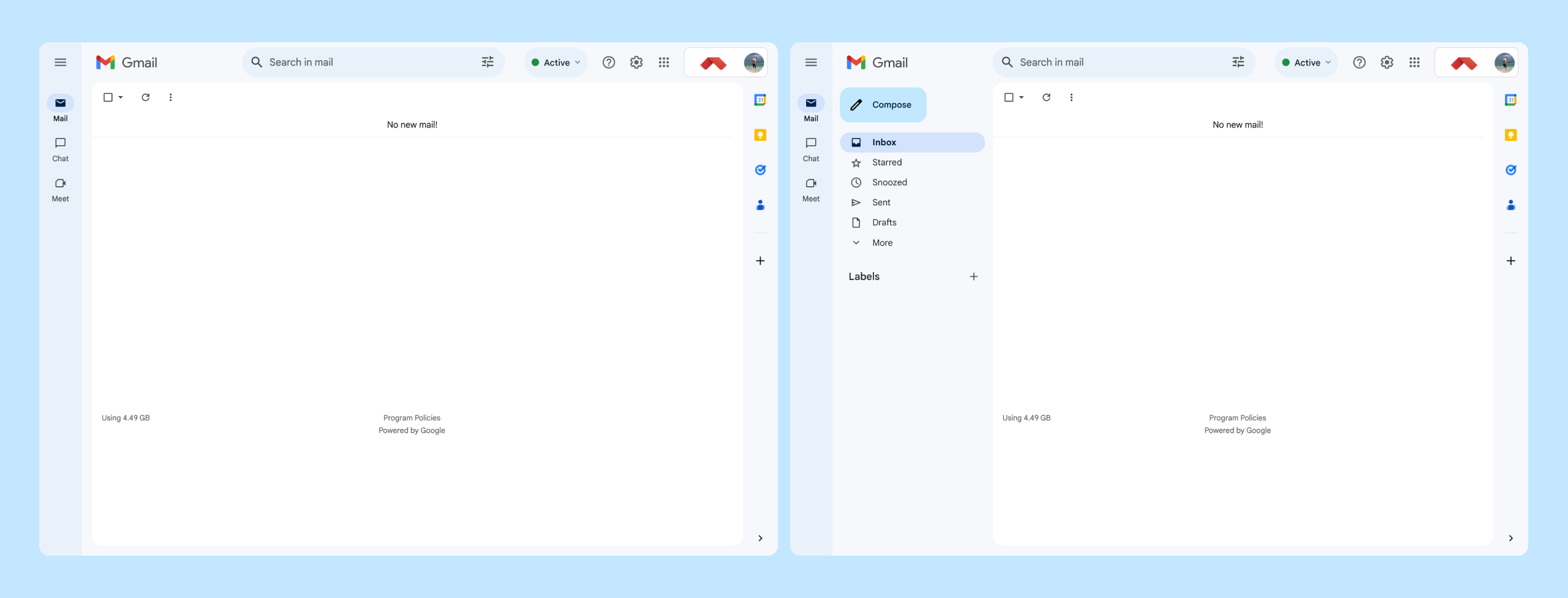
The navigation rail can take on more complicated embodiments, though. For example, in Gmail, it is attached to a specialized navigation drawer (discussed later). This expanded view maintains the primary destinations while revealing a secondary list of destinations.
Otherwise, the behavior of the navigation rail is similar to the navigation bar.
📚 Find more guidance: navigation rails on Material.io
Navigation Drawer
Definition
The navigation drawer, often derided for "hiding" navigation destinations, for being hard to learn, or for being a dumping ground of menu items, is nonetheless still a common and useful pattern in certain circumstances.
Drawers can manifest off-screen or on, persistent or not, but they always share some common characteristics.
Typically, the nav drawer lists parent destinations that are peers or siblings. A nav drawer can be used in apps with several primary destinations and some unique supporting destinations, like settings or help.
If you combine the drawer with another primary navigation component — bottom nav, for example — the drawer can contain secondary destinations, or important destinations that don’t directly follow in the hierarchy from the bottom nav.
When using the nav drawer, be aware of what kinds of destinations you’re presenting — adding too many destinations or destinations that represent different levels in the app’s hierarchy can get confusing.
Also be aware of visibility—reducing visibility or compacting navigation away from the main content area can be beneficial when it's intentional, but can also be a drawback depending on how the destinations in your app need to be presented and accessed.
Navigation Drawer in Use
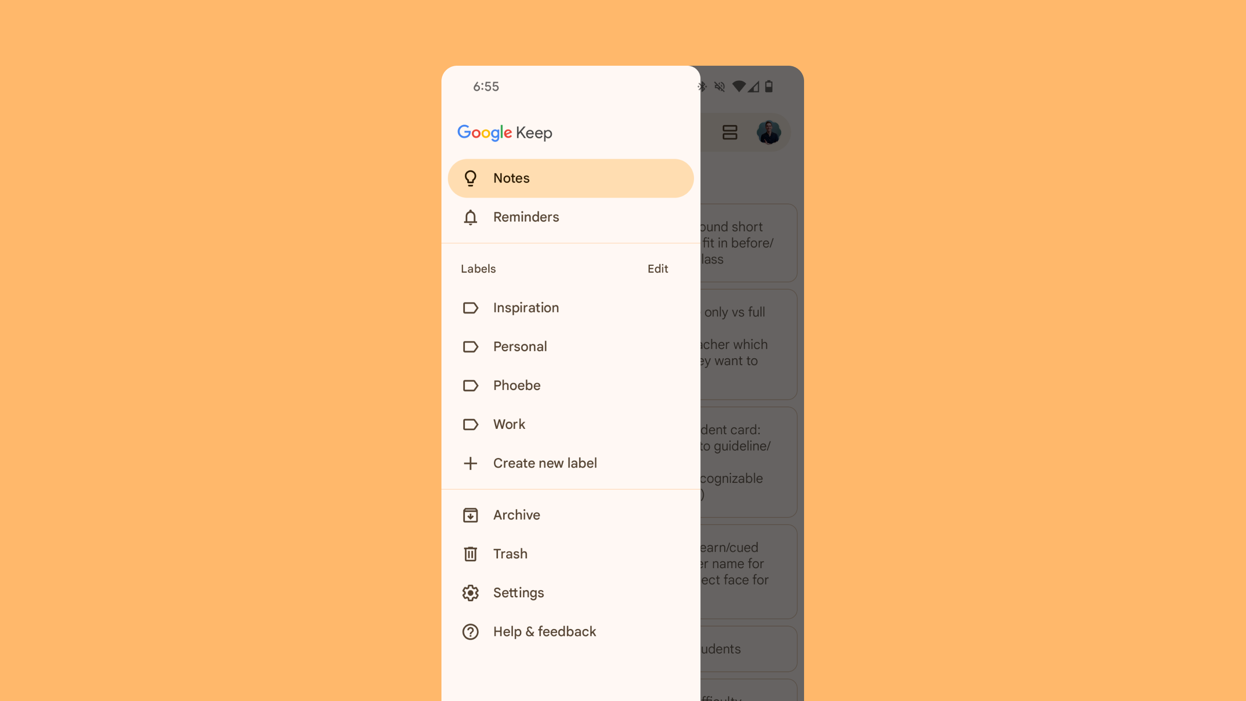
Google Keep relies on a navigation drawer for primary, secondary, and supporting destinations.
Primary: Notes and reminders, two distinct sets of user-created content in the app.
Secondary: Labels, an extensible set of views also created by the user.
Supporting: Deemphasized destinations like archive and trash, plus functional destinations like settings and help.
History
Nav drawers should generally create history for the system, taking the user back to the destination from which the navigation drawer was last used. Often, the back stack will take users back to the "Home" or primary destination of the app from any destination accessed through the navigation drawer.
📚 Learn all about navigation drawers here.
Tabs
Definition
Tabs are the first component in this list that explicitly navigates between sibling destinations that may not themselves be primary (or even parent) destinations.
Tabs are great for filtering, segmenting, or providing depth to related pieces of content. Unrelated pieces of content, or content with its own deep hierarchy may be better served by using other navigation patterns.
Tabs in Use
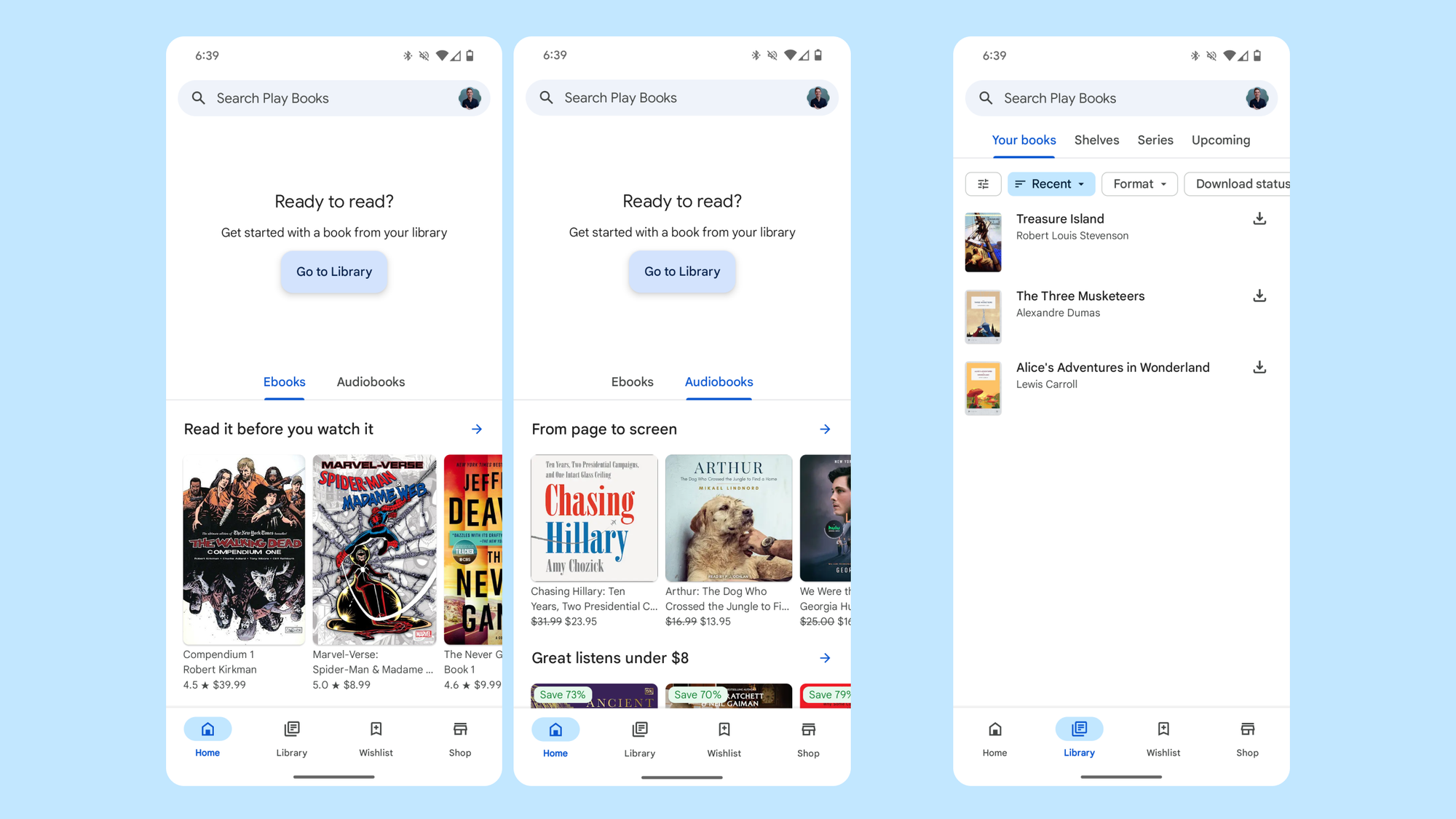
In Google Play Books, tabs are used on the "home" screen to categorize different types of books (ebooks and audiobooks), and in the user's Library, tabs offer different presentations of the same content.
In each instance, the tab bar appears in a different location in the layout, allowing for greater segmentation of the screen and prioritization of highlighted content.
History
Tabs exist on one level together, inside the same parent screen. So navigating between tabs should not create history either for the system back button or for the app’s up button.
📚 Find all the details on tabs here.
Contextual Navigation
Definition
In-context navigation is comprised of any navigational interaction outside of the components described above. This includes things like buttons, tiles, cards, and anything else that takes the user elsewhere in an app.
In-context navigation is typically less linear than explicit navigation — interactions may transport the user through a hierarchy, between different steps in discrete hierarchies, or out of the app entirely.
In-context Navigation in Use
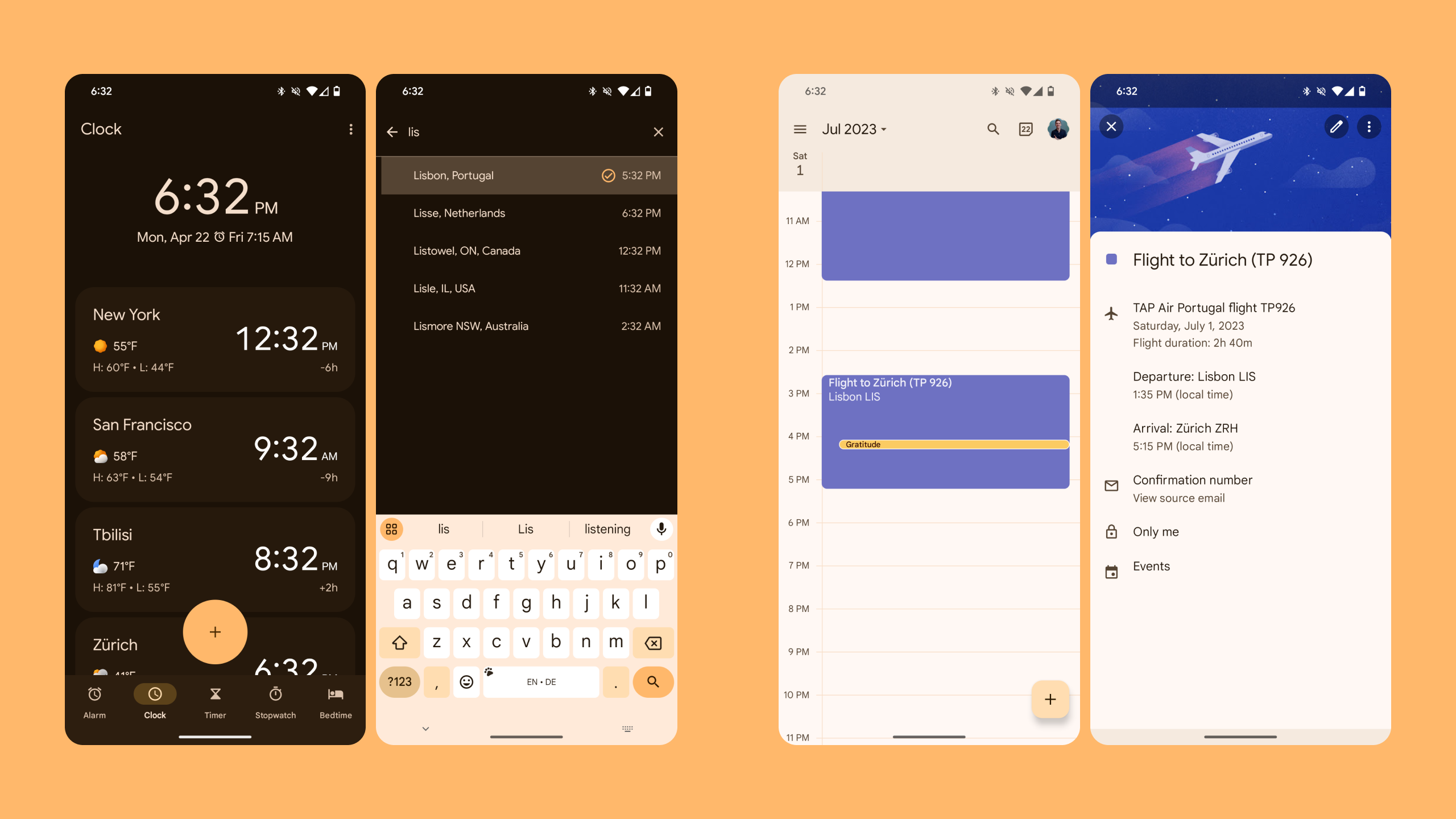
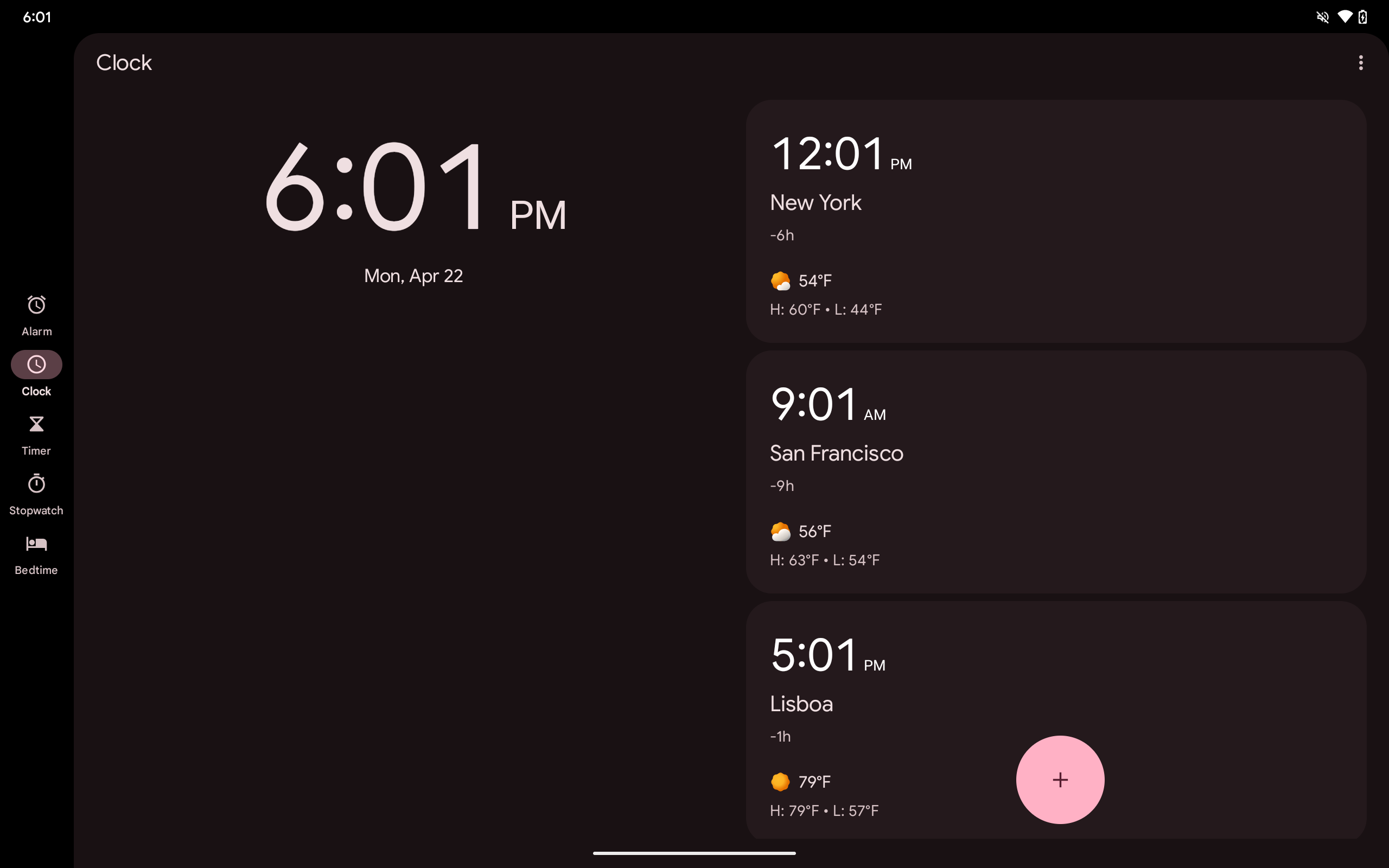
In the Clock app (above, left), the FAB navigates to a search view to select a new city, linking the user to part of the "add a city" task that itself is not directly subsequent to any specific destination.
Google Calendar (above, right) uses event tiles to navigate to event details, a clear child destination of the main calendar view.
History
There’s no hard rule for creating history via in-context navigation. Whether history is created relies entirely on what kind of in-context navigation the app uses and where the user is taken. In cases where it’s not clear exactly what kind of history should be created, it’s good to know what the up and back buttons do in general, so let's take a look.
📚 Get to know buttons, lists, and other components here.
🔄 Up, Back, and Close
The back gesture and the "up" and "close" buttons are all important to navigating an Android interface but are often misunderstood. The three actually have pretty simple behavior from an interaction perspective, so remembering the following rules should help get you out of any perplexing situation.
- Up is found in the app’s toolbar when the user has descended the app’s hierarchy. It navigates back up the hierarchy in chronological order until the user reaches a parent screen. Since the up button doesn’t appear on parent screens, it should never lead out of an app.
- The Back gesture is always available to the user. It navigates backward chronologically, irrespective of app hierarchy, even if the previous chronological screen was inside another app. It also dismisses temporary elements like dialogs, bottom sheets, and overlays.
- Close is typically used to dismiss transient layers of the interface or discard changes in a full-screen dialog. Consider the event detail screen in Google Calendar shown earlier. Gmail positions the message as a distinct level of the app and uses the up button instead.
🤔 Have Questions?
Still have questions? Leave a comment below (for newsletter subscribers), or tweet @MaterialDesign or @iamliam!


