


Design Space
noun
An imagined area holding all possible versions of a design, showing how each version is related and how specified features of the design can change.
Have you ever heard of Platonic idealism? The idea, basically, that visible objects (and phenomena like feelings) are just representations or instantiations of some more abstract Form that defines them. To get a feel for this, try picturing a rose. You might picture one that’s red, or maybe pink or white or yellow. Its petals could be tightly folded, it may just be a bud, or maybe it’s big and puffy. It may have dozens of petals like a cabbage rose or just a few like a wild rose. We can point to the specific ways in which these roses are different from one another, right? The color, the stage of development, the size, the number and arrangement of petals... These are all, nonetheless, roses.
Whether there is, in some other plane of existence, a true rose Form, we cannot say. But here on Earth, in everyday life, we intuitively understand most things that are roses as being roses.
What is Design Space?
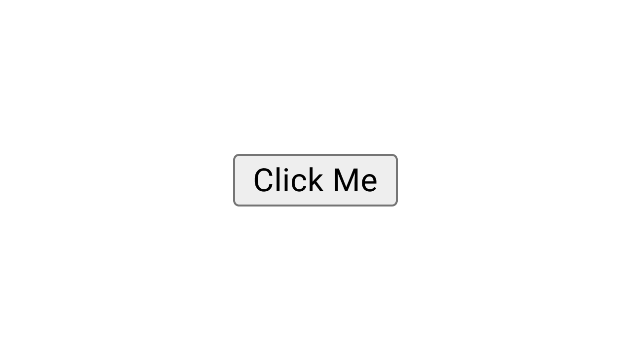
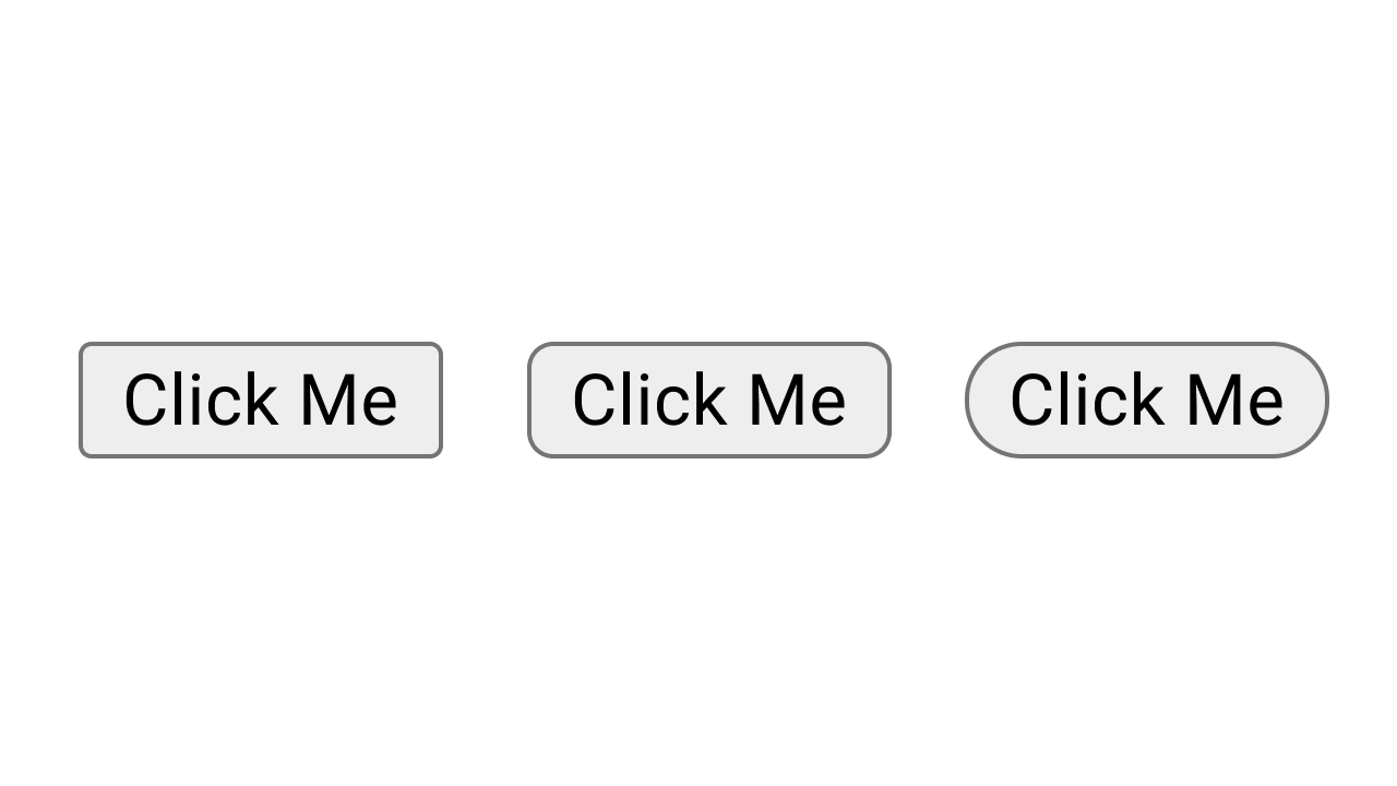
Imagine applying that same kind of sensibility to the interface. Let’s start really simple, with just a button. The “Form” of a software button, much simpler than a rose, is just a designated region of space on a screen that, upon interaction, triggers something to happen. In the Chrome browser, running on MacOS today, this is what a button looks like:
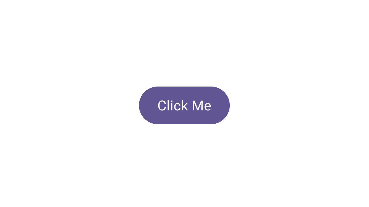
Meanwhile, here’s a default Material Design button:
How is this button different from the default Chrome button above it? I’ll take a swing at listing some of the ways they’re different:
- Shape: Material buttons have fully rounded corners, leading to a “pill” shaped container.
- Size: It’s not easy to tell from the images, but Material buttons are optimized for touch and, therefore, are a different size from default browser buttons on my laptop, which are optimized for my mouse cursor.
- Color: Material buttons have a color theme—here, purple—which influences their container and text colors.
We can pause here. There are other ways the buttons differ, but let’s keep the scope small for now. These three characteristics are all key ways that the various instantiations of the concept “button” differ from each other. Now, consider what a button would look like that’s halfway between the default Chrome button and the regular Material button.
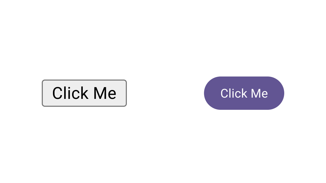
If we consider the Chrome button at one end of the spectrum and the Material button at the other end, we could calculate a midpoint between the two: the middle of the corner radius values, the middle of the color values, and the middle of the size values. It would look something like this:
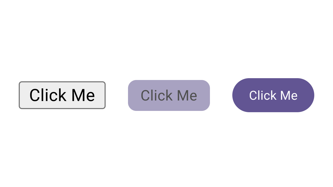
It’s not a very pretty button—we’ve just navigated three different characteristics to their midpoints pretty haphazardly. But what if we just isolate one of those characteristics? Like, let’s try just modifying the shape.
Much more palatable. What we’ve just done with this button is navigate one axis of its design space, in three stops: minimum, middle, maximum.
Axes
Okay, what’s an axis? We actually already know the answer to this from the example: in a design space, an Axis represents how one characteristic of the design can change. So in our button example, we’ve got size, shape, and color axes.
Axes in a design space are quantified. So they map to specific values, and have a starting and ending point. To simplify, let’s just look at the two simplest axes in our example:
Size: Our buttons above run from 22px high to 40px high. It’s a pretty short range.
Shape: From 4px rounded corners to 20px rounded corners. (Or, from around 20–50% of the button height).
The boundaries of an axis in design space are defined based on systematic preferences. For example, in Material Design, we have guidance and boundaries baked into components: a button, for example, shouldn’t become too wide, or else it’ll look like a pancake.
Space
Assume that these two axes are the only ones we want to build into our buttons. That means we have a two-dimensional design space. Each axis can be visualized the same way axes on a graph would be, with shape on one axis and size on another. As you navigate these axes, your button’s position in the design space changes. Try the demo below:
Our little two-dimensional space contains every possible combination of shape and size values for our button, within defined ranges. This allows us to open up our understanding of the button component from a series of discrete representations into a multi-dimensional Form. In this model, all versions of the button are the same button, just changed within the design space.
You’ll notice that the axes don’t always function independently. Even in this simple example, the shape axis is influenced by the size axis. This is because, as the button grows larger, it has more height. When it has more height, there’s more room for larger corner radii. Conversely, when it shrinks, you run into the max corner radius much faster.
Why Design Space Matters
Okay, time to fess up: design space is a familiar concept to anyone working in type design. Variable type necessitated the concept of design space to deal with typefaces that seek to be fully dynamic while also looking nice and functioning well. And those are the same needs that make design space crucial to UX design now, as we enter a more dynamic and adaptive era.
I’ve been visualizing dynamic interfaces like this ever since I started writing about them with Project Phoebe nearly ten years ago, and I still firmly believe this is the direction the interface is taking. If we want to build interfaces that function well while being more fully dynamic, it’s crucial to get a grasp on this concept now and begin integrating it into how we think about our work.
Adaptive Interfaces
Just as I wrote back then—and have since repeated—I think UX designers of the near future will be designing interfaces along axes like the ones we’ve explored here. Define the default, explore the extremes, and find elegant ways to interpolate between them in response to user input.
This is, essentially, adaptive design. We already see approaches like this in design systems like Material, where dynamic color responds to unknowable user preferences and inputs (your wallpaper and contrast preferences) with consistent, functional, and usable results. And component adaptations in the system work along similar axes to the ones we’ve explored in this post: axes like size, spacing, and composition shifting based on signals like screen size and orientation.
Oh Yeah, AI
If we abstract the notion of adaptive interfaces into interfaces created or managed by machine intelligence, design space becomes an even more urgent topic. Given the non-deterministic nature of LLMs—including in interface generation (more on that in an upcoming newsletter)—the logic constraining the output of a model that generates interfaces would need to be defined and included as part of the model’s instructions. This means that no matter where AI lands in our process, we as designers will need to understand the concept of design space to get better results.
Apply Design Space Thinking
If you already work on a design system, you’re well-positioned to apply design space thinking to your components and guidelines. If you’re working with a design system in your product (or design your product on its own, or just vibe) you can still apply these principles to the styles, flows, and patterns that make up your app.
1/ Identify Axes and Limits
First, you’ll need to identify the axes that are relevant to both the component or pattern and your users.
Axes like shape or color may be relevant to products that want to offer personalization or create different moods in different parts of an app, or in cases where you want to imply things like priority or interactivity based on visual signals.
Just as important as defining the axes is defining their limits. For our button example, the shape axis has clear limits: it moves from no rounding to full rounding, represented either as a hard pixel value or as a percentage of the component’s height. But for a bottom sheet, you may need to limit how round the corners get so you don’t cut off text or other important content.
In the absence of obvious hard limits, you may need to impose a beginning and end to each axis to preserve usability. Consider our button’s size axis, for example: it may not immediately be clear where the limits are, because a button can be placed in so many different scenarios. Sometimes, it can be presented over content and can therefore grow forever. Sometimes, it’s important that the button does not occlude content, so it would need a hard limit.
Integrating design space thinking into your practice is a recursive process—you’ll return to this step a lot as you work, slowly recording your observations and conclusions until your axes (and, thus, your space) are well-defined and reliable.
2/ Visualize and Test
In Material Design, when we launched “theming” back in 2018, we explored the subsystems of color, shape, and type within axis-like ranges, explicitly delineating how far each characteristic “should” be pushed in most products.
We did this by creating a series of “studies,” or fully fleshed-out software products that could show us how our system behaved in real-world scenarios. Some of these apps included visualizations of themes that went outside our guidelines by pushing the subsystems further than their limits. We called these explorations “black diamond” themes to designate that they were advanced or outside normal bounds for most makers.
Visualizing these extremes is really helpful in testing the boundaries of your axes (and your design overall), and is a crucial step for setting up your design space.
As you work, you’ll also find out the shape of your design space. How many axes? How do they influence one another?
You don’t need to visualize it in a graph as I’ve done in this post, but it may help to quickly test different combinations and perhaps tie certain axes together.
3/ Design for Flexibility
You might already be doing this step, but this is where everything else comes together.
In a world where interfaces are becoming more dynamic and where more devices at the very least offer free windowing (meaning your app can resize to any aspect ratio or size), you have to assume that every screen’s layout must be flexible; that the size of every major building block can change, and that every smaller pattern or component may be able to work better within that framework by shifting its presentation dynamically. Designing with this in mind from the beginning will make it a lot easier to set up your design space.
Blast Off
Thinking about design space in order to make a more flexible interface means creating an interface that’s ready for adaptation, personalization, and dynamic (so, AI-powered) instantiation. These kinds of dynamism are what comes next for the field. No matter what a model is able to generate, you’ll need to have an understanding of how, when, and why the interface should adjust, and the design space is your universe.
Questions? Leave a comment below or sign up for Doubleshot where I’ll talk about this topic (and many more) in the future.


