


Design Notes, my podcast about creative work and what it teaches us, has been a side hobby for me for almost ten years now, which is hard to believe.
Several years ago, I broke down its identity (and a bit of its history) in a post that now lives here on Interface Café. Here’s a short version:
I started Design Notes sometime in 2015 or 2016 while I was living in New York. Most of the time, I had friends from the Android community on the show and we talked about our work for around an hour or two. In 2017, after I joined Google, I worked with the Google Design team to bring the show internal, publishing many episodes on the site. As part of that, I had the chance to work with folks like Anthony Zukovsky and Viktor Persson on developing a consistent identity (visual and audible) for the show.
Now, about 8 years hence, I revisited the identity along with my colleague Beth Abrahamson. We’ve come up with a new system for the show that stays true to its roots while making it fresh, bold, and focused. I wanted to take some time, as I did before, to lay out what the system entails and how we’ve thought about it during development.
The core components
Composition
The previous Design Notes identity was very image-driven. Visuals from each guest—sketches, photos, renders—were included in episode art as the primary focus, with any text or overlays serving a secondary role.
In this new iteration, the basic frame of the asset is preserved, with a space carved out for custom imagery on each episode. This more focused approach keeps the assets more consistent and avoids many of the issues I faced with legibility in the previous system.
Typography
The first thing I have to talk about within the composition is typography. We’ve changed the approach to Design Notes art, and it’s now more type-focused.

We use Paragraf, a Future Fonts project by Typeji. For the logo, I set “Design Notes” and made a few interventions on the letters to open up some space. In versions of the logo where the letters were protected by a colored border, the border overlapped too much, creating a lot of jagged edges.
To alleviate that, I brought down the serif of the N, clipped out the bottom left of the e, clipped the left serif on the i, and cut around the lowercase g to accommodate the second e. In this way, the logo still looks almost like it’s outlined, but also that the letters are closely nestled together and interrelated.
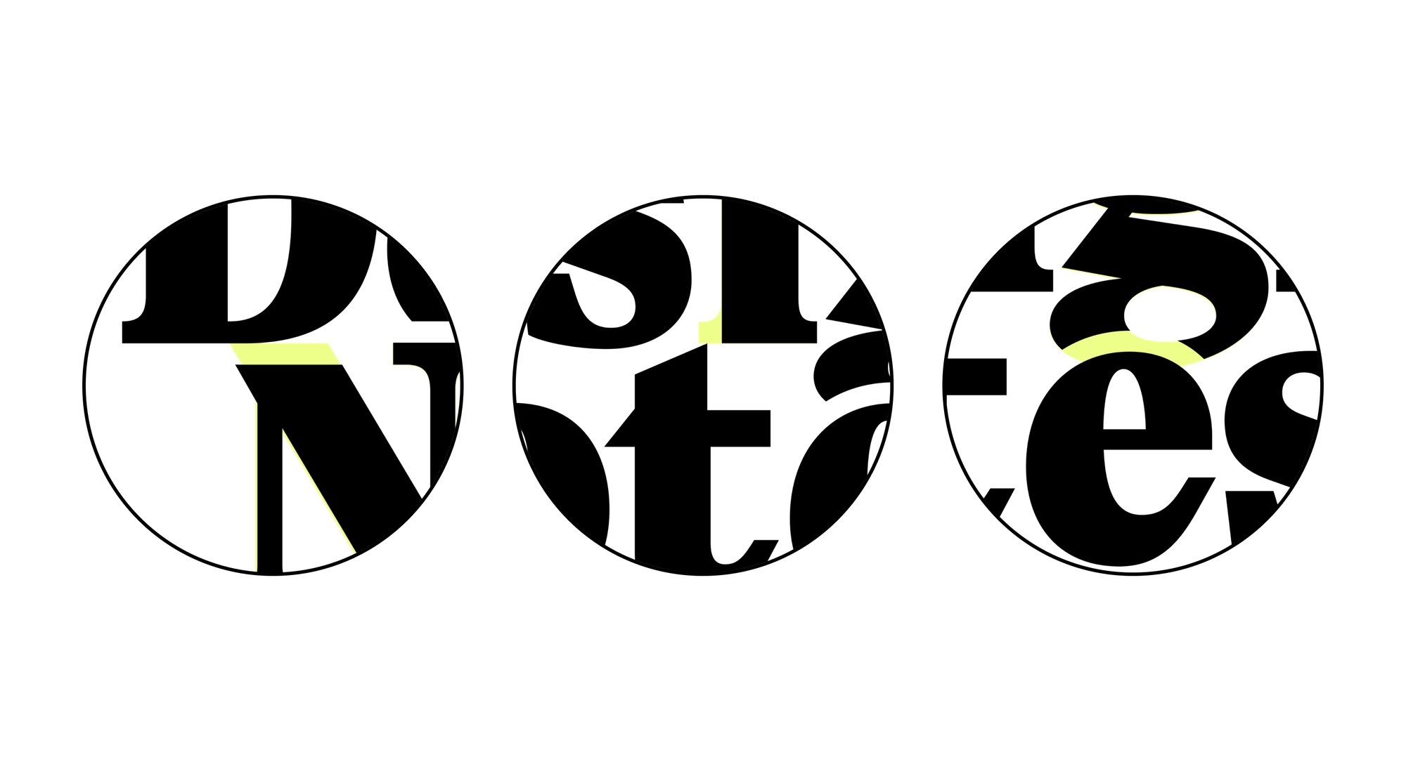
With these few tweaks, I was able to open up the logo to overlay anything (even with a stroke) without creating unsightly gaps or edges.
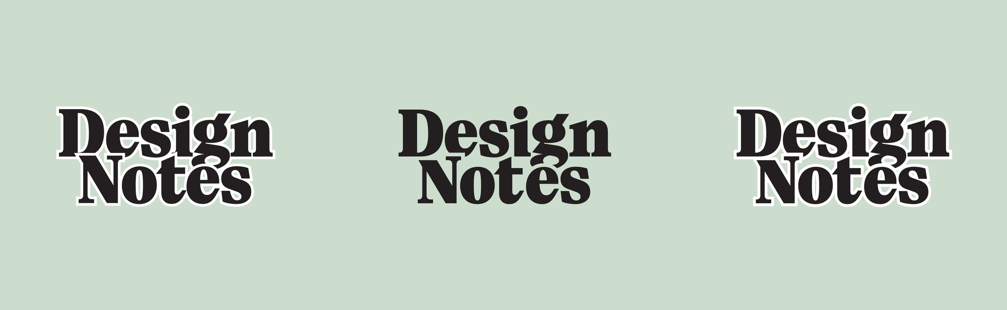
And, just like before, the type also relies on a relational sizing method for different levels of emphasis.

Color
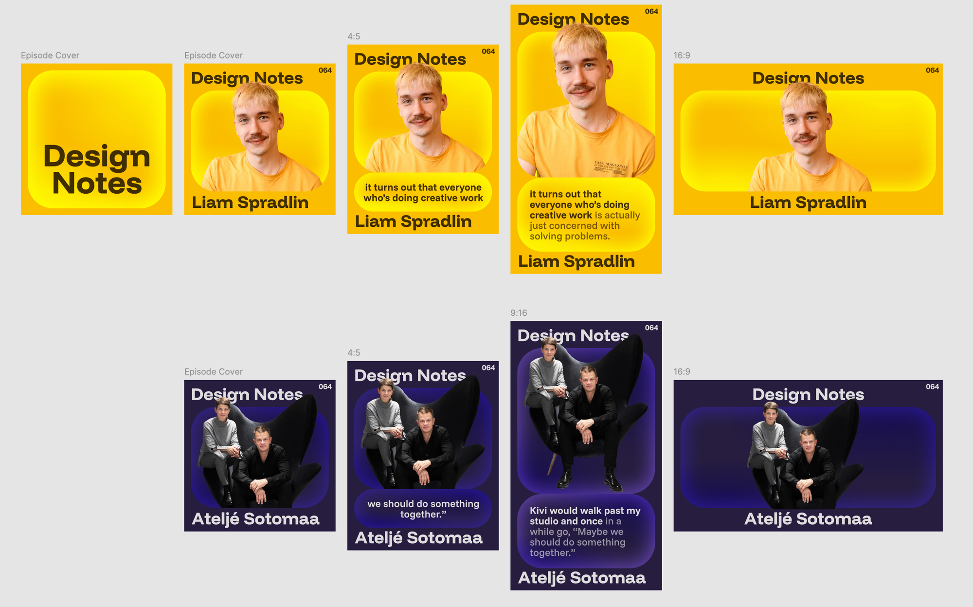
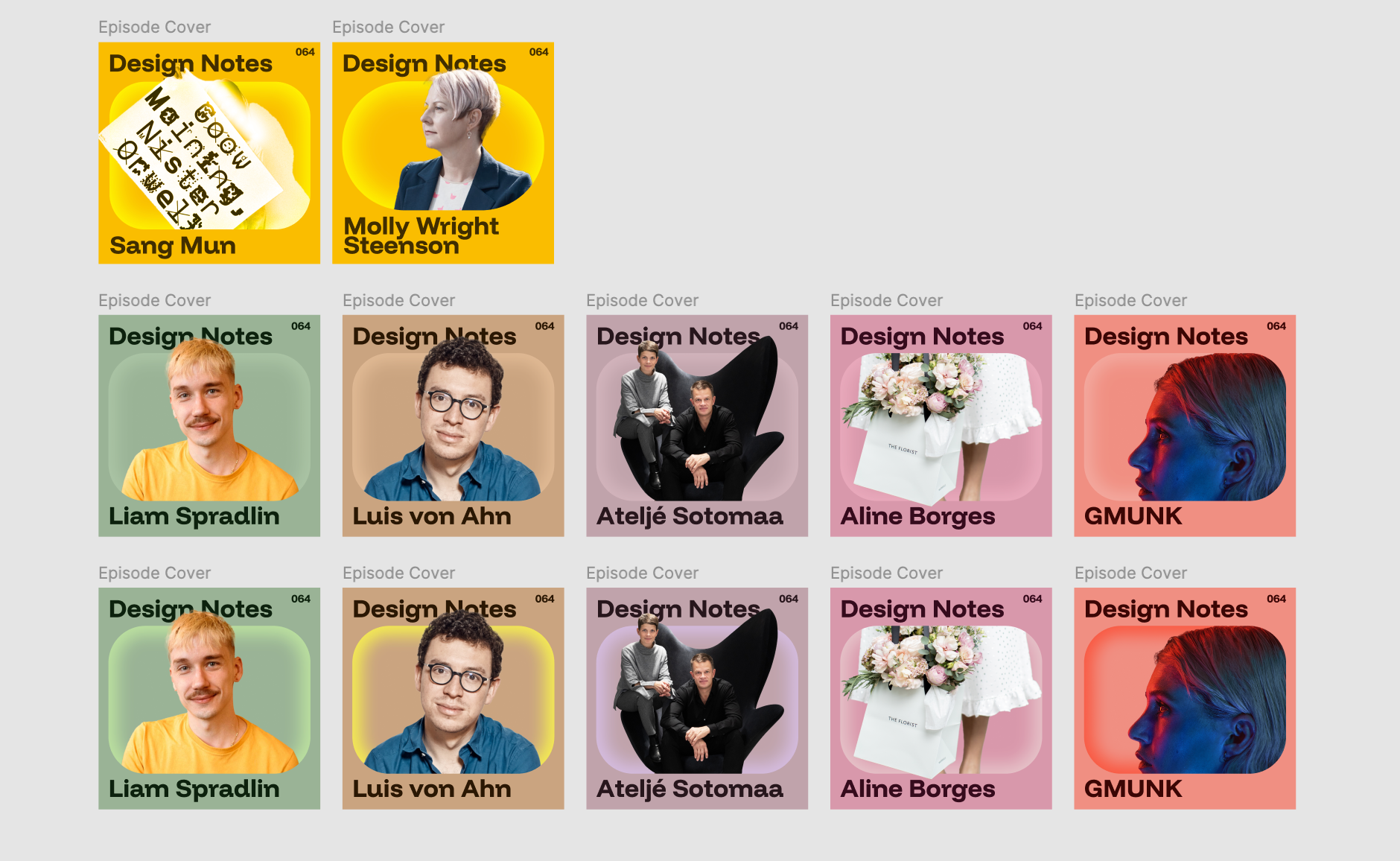
With this new identity, we took a much more intentional approach to color. Episode artwork and assets are no longer customized based on their image content. Instead, we have a base color and a “spotlight” where episode imagery lives.

The base is an eye-catching yellow-green #EEFF89. The spotlight is a gradient going from #CDDDCD in the center out to #F0FAD1 at the edges.
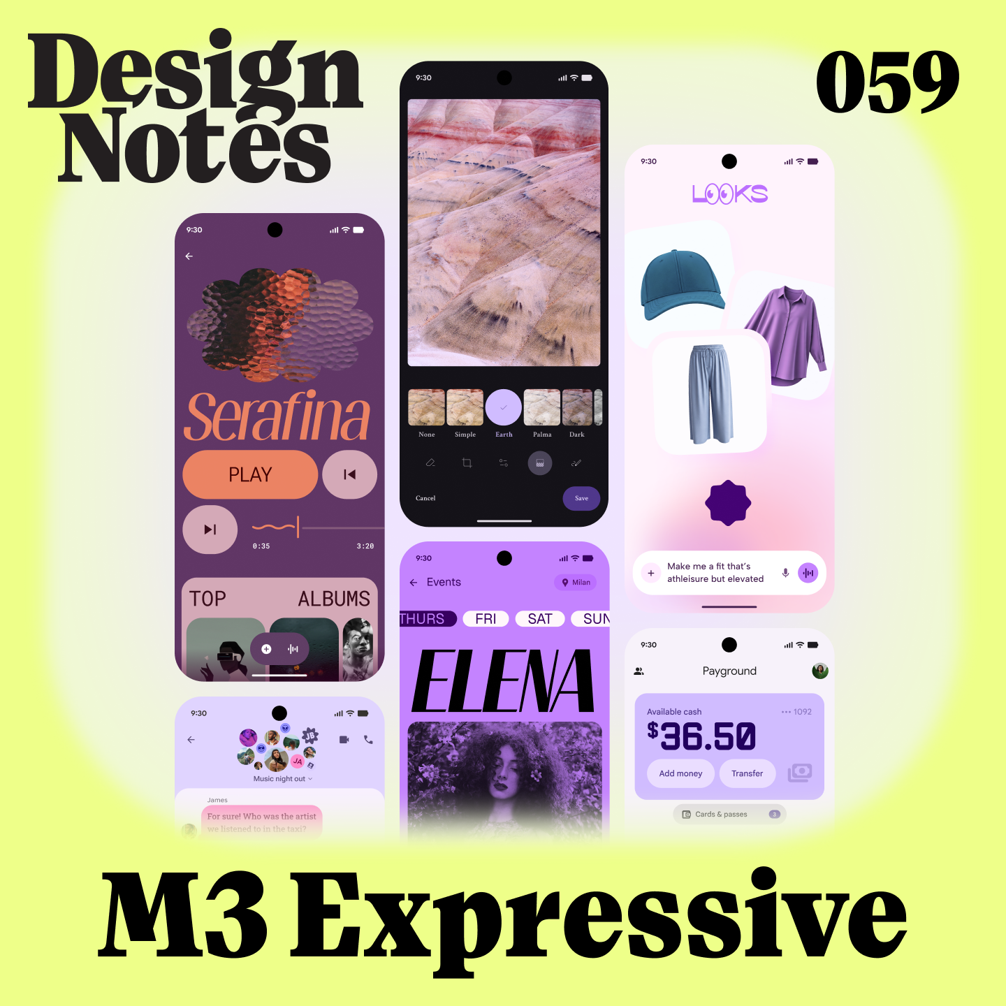
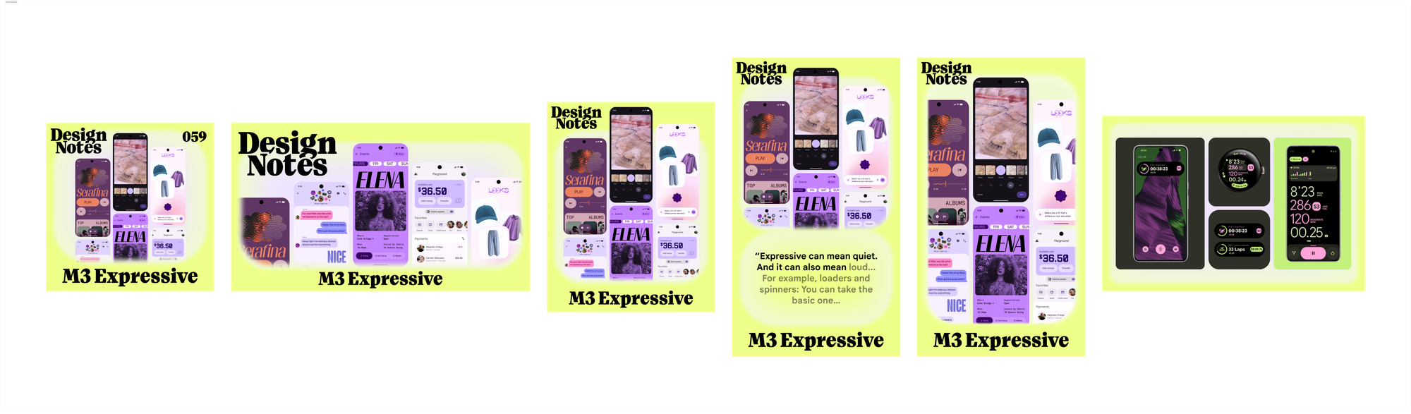
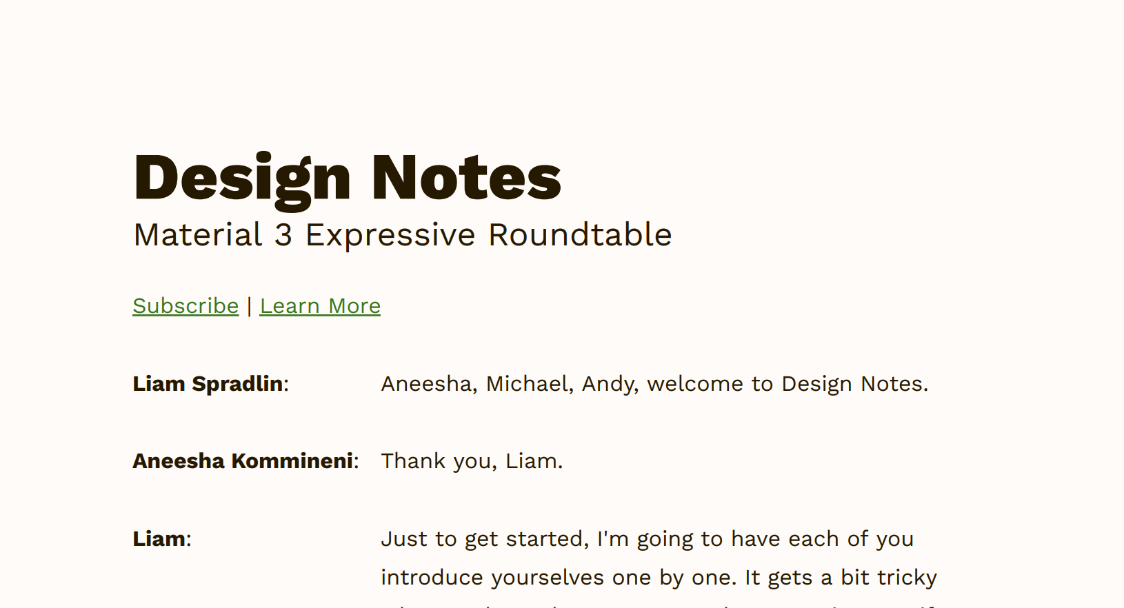
For the M3 Expressive episode in particular, we experimented with adjusting this gradient to match the episode imagery:
Here, the center of the gradient is a light lavender color pulled from the mockups we placed on top.
Imagery
The new Design Notes art is much more people-focused. Even the cover has a picture of a person (me).
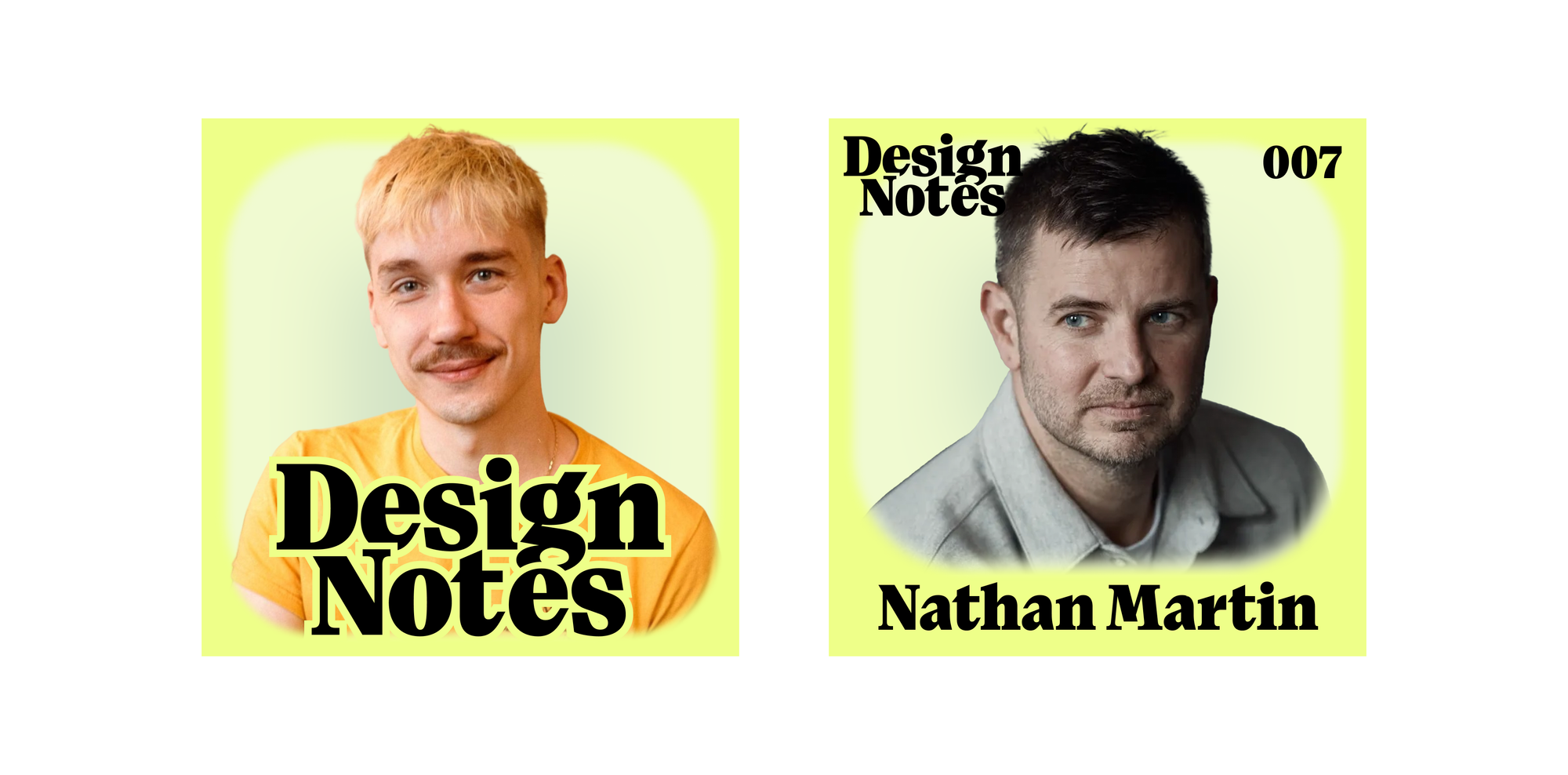
Episode covers similarly focus on the person being interviewed. Their portrait is masked by the “spotlight” element I mentioned earlier, which scoots out of the way to keep their name visible at the bottom of the cover.
In cases where we have multiple guests (like the Expressive episode) or where the guest doesn’t want to be pictured, we can fall back to photographic assets of other things with a similar treatment.
Putting it all together
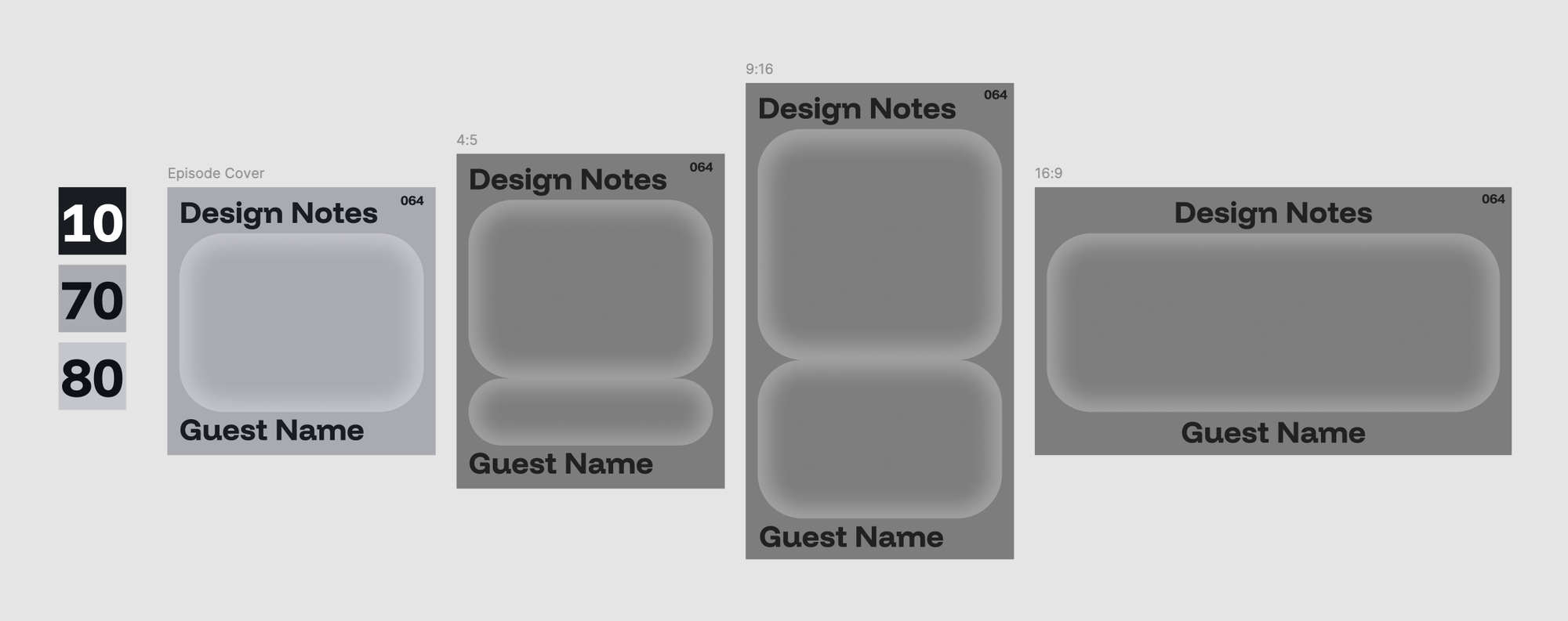
Last time I wrote about the Design Notes identity, I divided the assets up into four categories: Podcast, Article, YouTube, and Social. But, since then, social platforms, podcast players, and even the GD blog have changed. So, for this iteration, I simply divide the assets up by aspect ratio.
Visual assets
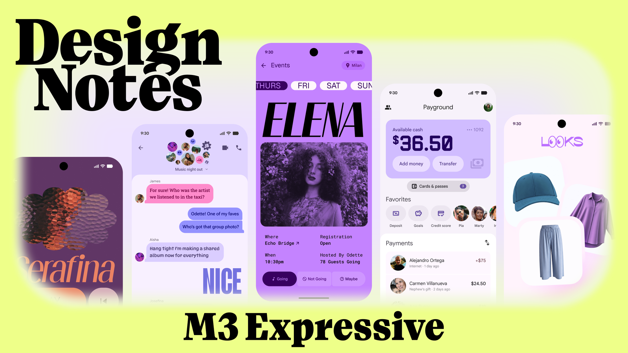
Here’s a look at all the assets for the first episode that uses the new art style:
From left to right, we have
- the 1:1 asset, used for cover art
- the 16:9 asset, used for the animated header on design.google and the YouTube thumbnail
- the 4:5 asset, used as a thumbnail for the Instagram grid post or reel
- both an animated and static version of the 9:16 asset, used for vertical video
- and a frame created for inline assets, to be used in a design.google article or other posts.
The new art style makes it much easier to create and distribute assets because of the new “spotlight” layout that can grow and shrink, along with the regular type treatments that appear throughout all variations of the art. The most unique layout is the 16:9, which emphasizes the show logo. The rest of the assets use the same system and treatments as the album art, and can flex for any platform.
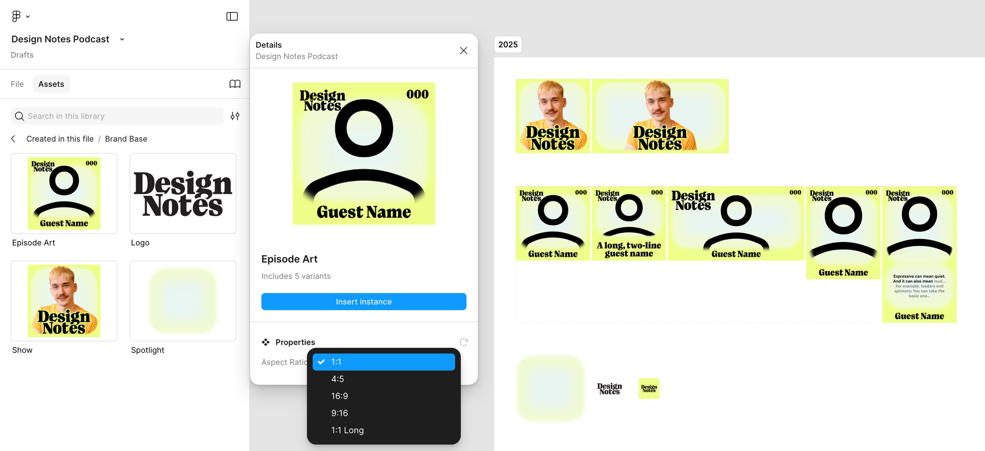
Inside our Figma file, the show art is a component, and changing the aspect ratio will automatically recompose the base elements into each of the assets shown above.
The transcript
This is one aspect that’s gotten only a minor update since last time. The transcript PDF (downloadable from Google Design and linked in show notes) has gotten an updated type treatment, colors, and links, but otherwise retains the same basic approach as before.
The website
Finally, the last place I want to highlight the new system is a simple webpage for the show: design-notes.show (which is also a Bluesky handle)
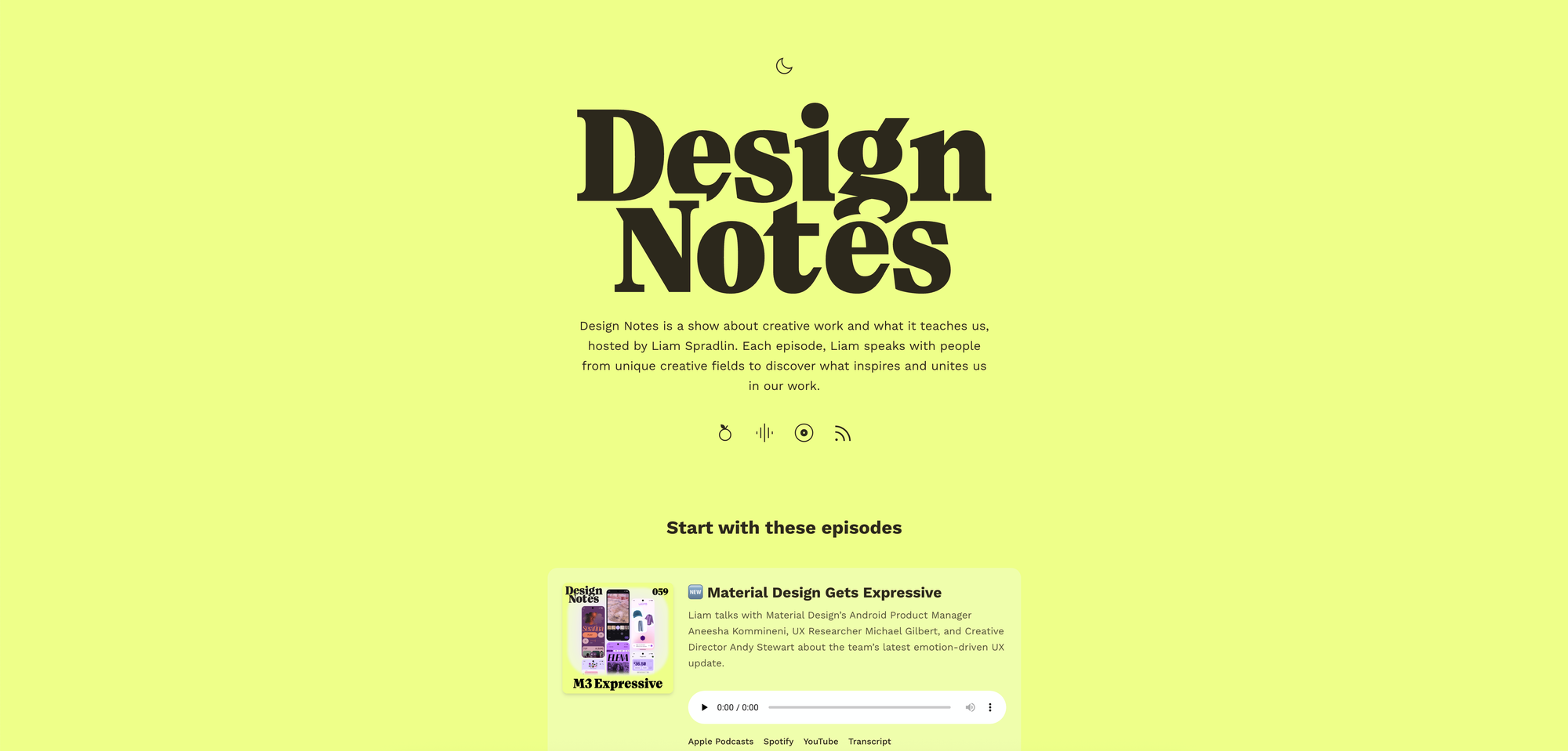
The bold new logo and color scheme do great on a big canvas like this, and everything fits naturally with Material icons.
Offcuts
Lastly, I’ll give a peek into our Figma file and some of the directions that didn’t make it.
From the outset, we were clear about wanting a bold art style that would be readable at small sizes, and which better contained episode imagery.
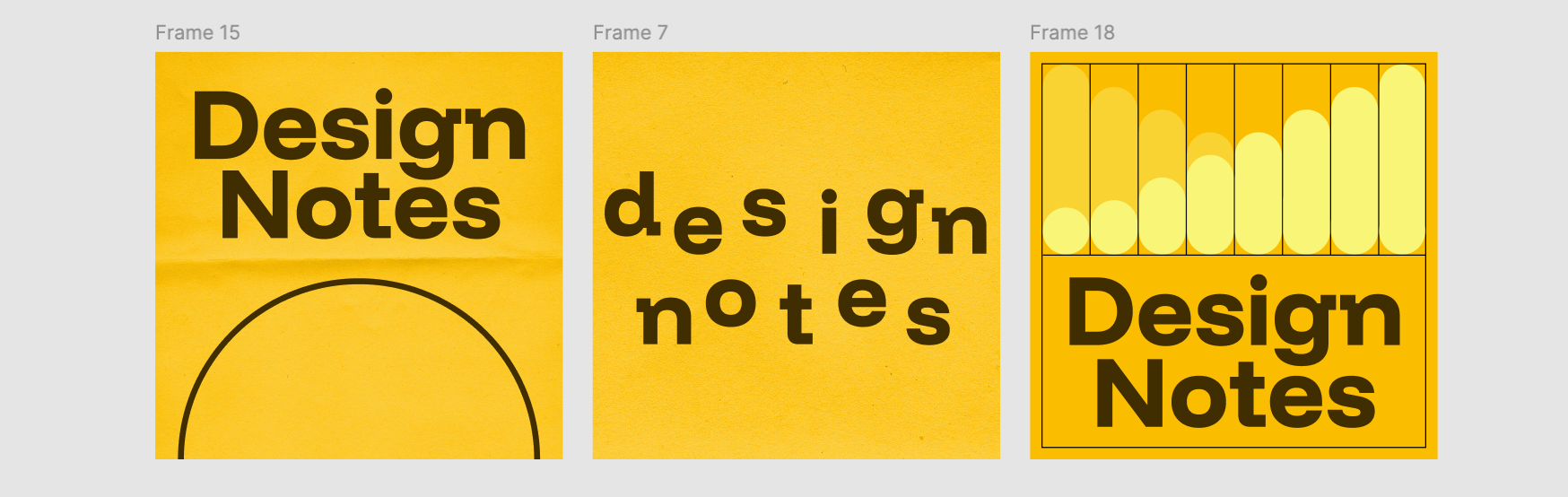
It remained important to me that the episode art have a place for guest images, whether they were portraits or examples of their work.
The spotlight or container treatment emerged pretty quickly, and seemed like a good opportunity for animation, with a fluid, cloudy blob of yellow behind the main imagery.
Once the spotlight concept was established, I also experimented a lot with different color treatments, to try and preserve the variable colors of the old art style.
But it quickly became apparent that this wouldn’t really scale, and would result in a lot of inconsistencies. Even trying to narrow the palette to 5–6 shades, all roughly at the same vibrance as the main art (which was yellow at this stage) showed too much variation to really read as belonging to the same show or collection.
I also tested out relational color treatments to try and generate a consistent vibe across assets, but in the end we landed on one basic color treatment that unified the whole show.
We had actually planned to use only photographic or portrait imagery for the episode covers, but the style immediately got stress-tested by the M3 Expressive episode which featured three guests. Without a group shot of all three together, it proved too hard to create a compelling composition of three distinct portraits that didn’t crowd the cover art, so we went with a more illustrative cover instead.
Just like before, working on the visual identity for Design Notes has been a great exercise in working out how to systematize a mini-ecosystem of assets and webpages. And digging back into the archive to test out the new approach with real guest assets was rewarding, reminding me of the show’s original mission to uncover what inspires and unites us in our work.


