


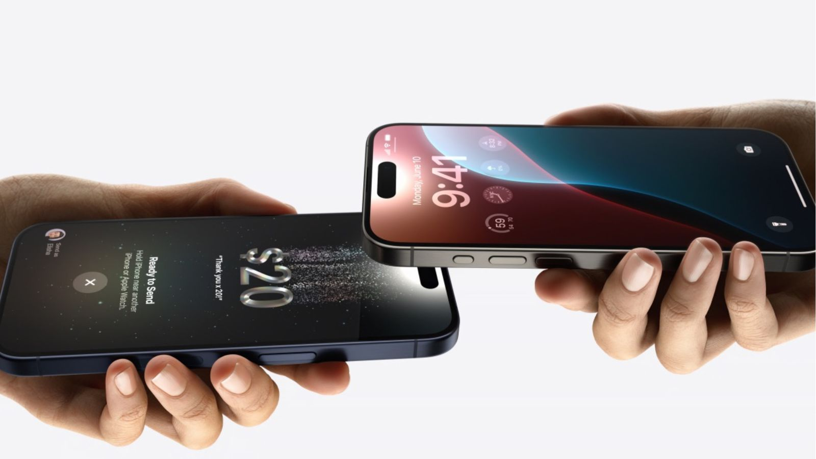
At WWDC this week, Apple showed off a new “Liquid Glass” design language. There’s a lot to be said about the nuances of the system, especially as part of Apple’s broader effort to unify platforms technically, taxonomically, and visually. But I want to talk about the idea of glass in interface design, because that part isn’t new, and because I think there’s a lot to learn from glass’ role in signaling newness and technical sophistication, and about the role of aesthetics in the interface.
I’ve written in the past about the morphology of the interface—the visual form our UIs take, the implied materiality of design system components, and the complications behind coining a new “–morphism” in UX circles. I talked in that earlier post about what a real skeuomorph is: something that makes functional elements into decoration, bridging the gap between known and novel through metaphor and allusion.
But an interface that references real-world materials is doing more than that, especially in the case of glass. Such interfaces create an aesthetic impact that carries other signals and implications to the viewer. It does this instantaneously, because aesthetic is about perception of the senses, an involuntary and immediate process. Glass in particular has been used to this effect for decades, cyclically popping up alongside software updates to signal newness, technical sophistication, and innovation to the user.
In this post, I want to dig a little deeper to understand why glass has been used so often for this effect. Is it just... because glass is shiny? Or is there something more?
Aero. Frutiger, even.
The announcement this week immediately drew comparisons to the Aero design language of Windows Vista.
Aero (which in 2009, according to Microsoft, stood for Authentic, Energetic, Reflective, and Open) is viewed today with nostalgia. It even inspired a neologistic “aesthetic” title: Frutiger Aero (unsurprisingly a combination of Aero and “Frutiger,” as in the Swiss type designer). More on that later.
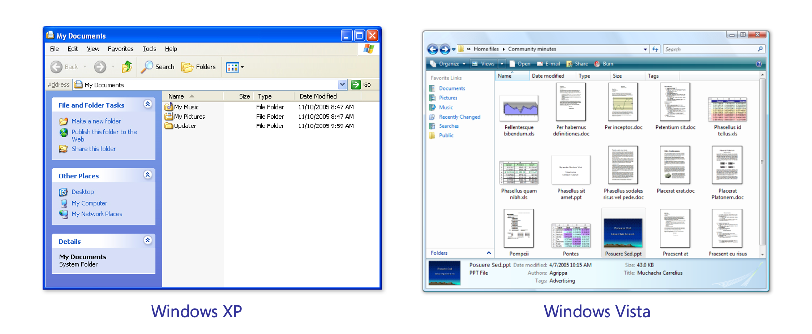
The Aero language was introduced with Windows Vista, making a significant update to the platform following XP’s jewel-toned gradients. At the CES announcement of Vista (which was opened by an Angels and Airwaves cover of What a Wonderful World), Bill Gates said that Vista would be “key to the era we have today,” drawing a line between the innovation of Windows 95’s graphical interface 12 years prior to Vista’s updates. The product guide described Aero this way:
A noticeable new element of the Aero experience is the professional-looking, transparent glass design, with subtle effects such as dynamic reflections and smooth animations. The glass windows create an open, energizing environment and enable you to better focus on your content rather than on the surrounding interface. —Vista Product Guide
Lead Program Manager Kam VedBrat, in a video interview, stressed Aero’s transition animations and states on things like window controls, and the fact that the glass interface made windows feel “light” by comparison to XP’s blue borders.
The Vista update required higher specs to run, and basic versions of the OS didn’t come with Aero. Users complained not only about the spec requirements, but that Aero apparently cost a lot in terms of battery life on launch.
But this was kind of part of the point. Aero was meant to feel like a new era in the graphical interface, but its new animations and translucent visual effects weren’t necessarily a new idea. The computational power that would come with the latest generation of PCs was. Aero was a design language built to take advantage of higher technical sophistication, and its visual effects signaled that.
Today, the collection of aesthetic influences bundled together under “Frutiger Aero” catalog a movement in 2000’s design where the glossy blend of glass and nature spread across software and graphic design (including its influence on web 2.0). It’s often described in terms of its optimistic and futurist tones.
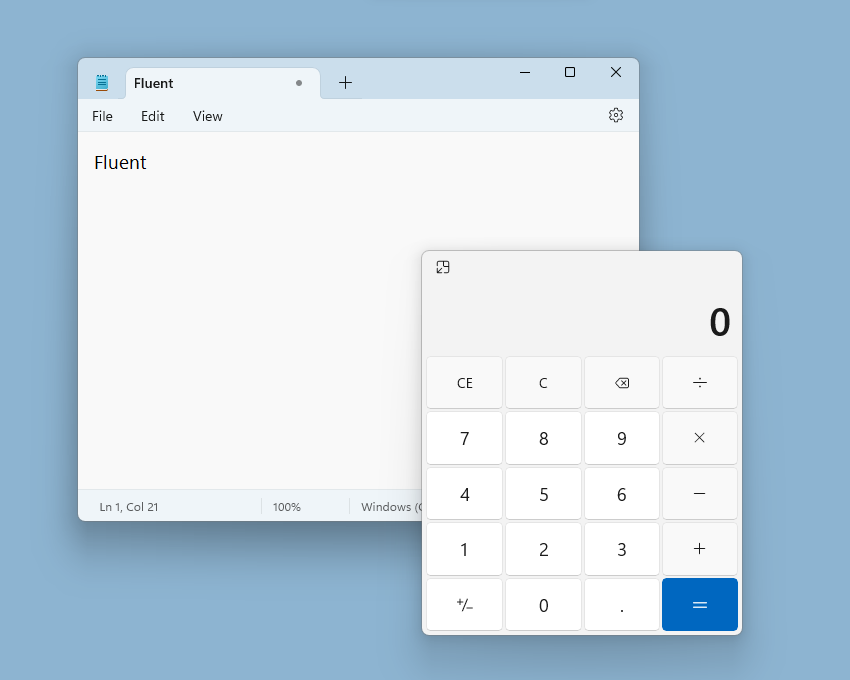
Fluent
Microsoft revisited translucent UI elements in its Fluent system (originally launched in 2017) with “solid, acrylic, mica, and smoke” materials.
The Fluent design system, like Aero before it, was intended to signal a new era for the Windows interface.
The previous aesthetic, Metro, was completely flat and experimented with flat, tiled interfaces and solid color blocking. Following expansions into (and contractions away from) other form factors, Windows needed a fresh look to turn the page.
Given Material Design’s investigations into the materiality of the interface starting in 2015, it made sense for a new design system from Microsoft to do the same, adding explicit material types to its repertoire. It was a kind of fusion of the shiny, flashing glass of Aero with the restraint of Metro and flat design.
First showing up in Windows 10, the Fluent design system has continued to evolve.
Glass Isn’t New for Apple, Either.
Glass, in its liquid form, may be the focus of Apple’s new platform updates, but the concept of using glass (whether frosted or clear) isn’t new for Apple, either. Glass (along with felt, fabric, metal, and leather) were all part of early iterations of iOS, and a glass dock (whether tilted or flat) has been present in MacOS (and OS X before it) for a long time.
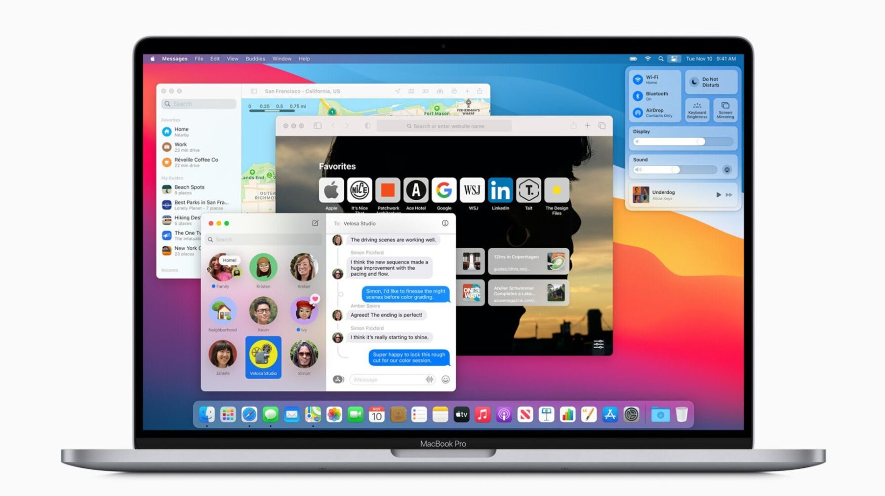
Around the same time that Microsoft was iterating on Fluent Design, Apple updated MacOS (in 2020) to Big Sur, reintroducing frosted and clear panels to app windows and quick settings.
It was the first time in years that Apple had revamped the Mac’s interface design paradigms, again signaling a new direction through the technically and visually sophisticated frosted glass.
Liquid Glass
Is it any surprise that Apple’s latest design turn would be toward another, newer, more complicated version of glass interface elements? The company’s work with animations that alter and distort the content of the screen has sped up in recent years, particularly with the emergence of generative AI as a system feature.
The movement back toward glass (with a new approach to meet the technological moment) is a logical change that ties up many of the threads that have been woven into their platforms.
Digging Deeper
From looking back into the glass histories of major software platforms, it’s clear that glass is a perennial signal of newness and technical advancement.
Part of this is down to the fact that rendering glass as a main part of the interface is technically more intensive than rendering color blocks or static textures. Background blur, interaction states, scrolling, and animation all require more technical sophistication (in terms of programming, design, and hardware) while at the same time creating a much more substantial aesthetic impact.
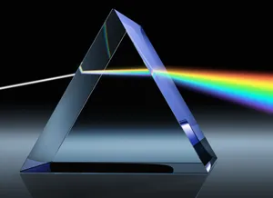
But this isn’t limited to digital representations of glass. The full-color smartphone screen—itself made of glass—is faster and more dynamic than most things in our home environment. And beyond electronics, glass in the real world also has the effect of augmenting, occluding, revealing, obscuring, or distorting the environment around it.
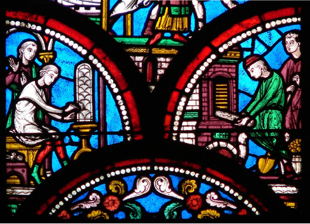
This has been used to create aesthetic effects for as long as humans have worked with glass, from vitrifying glazes on pottery to intentionally crafted glass artifacts, stained glass, and lenses. Producing sophisticated glass artifacts is difficult work with tangible materials, too. It changes how you see your environment. It can be more aesthetically interesting than flatter or less dynamic materials.
In the end, this isn’t a post about Liquid Glass. It’s just a post about glass in the interface—whether it’s the graphical interface on our phones and computers or the interface of the environment around us.
I think the augmentation glass provides—blurring or obscuring what’s behind it, breaking apart or focusing light—is part of what makes it visually appealing wherever it shows up. The distortion creates an aesthetic impact, not just of sophistication or beauty, but of wonder, curiosity, mystery, or awe. Not to take it too far, but maybe the reason software designers continually turn toward glass isn’s just about proving what the technology can do.
Maybe it really is because glass just feels nice to look at.


