


For several years, a big part of my role at Google was working with external designers and their teams. In conversations about apps or features with a lot of controls, a question that came up often was, “should the ‘expand’ arrow point up or down?”
It was a question about the “statefulness” of buttons. How do we communicate to the user what the button does, but also make them aware of what it’s already doing? In other words, its state and its function?
This complication is a result of how flexible the concept of a button really is. It's just a region of space on screen—usually delineated by some visual container—that triggers some action. That action can be navigation, selection, or modification. Within each of those categories are almost limitless possibilities.
The question of the "expand" button is a question about how we use these regions of space to communicate what they do. To let users know what is possible and what to expect. Should the expand arrow point down to indicate it can expand? Or should it point up to indicate that it is not currently expanded?
This is a problem I think Material's expressive buttons solve really well. The container of the button itself, sometimes overlooked, actually serves the purpose of adding another visual indicator to its statefulness. Besides changing color, the containers for toggle-able buttons changes shape, spreading out to match its depressed state and getting smaller and rounder when it's released.
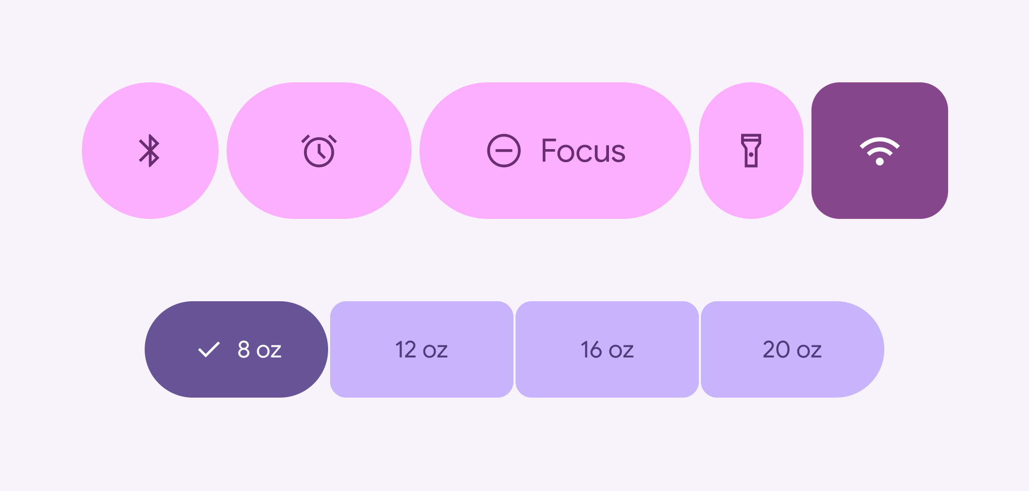
This can be complemented by adding a selection icon, changing the icon that's already there, and even changing the width of the container based on its emphasis.


